
Mega Menus vs. Drop-Down Menus: Which One Is Right for Your Website and Meets UX and Web Accessibility Best Practices

Navigating complex websites can often feel like finding your way through a maze. This is where a well-structured mega menu comes into play, offering users an efficient way to explore content while following web accessibility best practices. But what are mega menus? Why are they advantageous to users, and when is it best to use them? These are important questions to consider as you begin restructuring your content.
What Is a Mega Menu?
A mega menu is a navigation menu that displays many choices at once, organized into groups and subcategories. This structure helps users quickly scan options without navigating away from the current page. It also helps reduce the number of clicks while increasing accuracy in locating the right content.
Typically, mega menus are more structured, providing an overview of available options within a site's complex information architecture (IA) and embodying web accessibility best practices.
Regular Drop-Down Menus vs. Mega Menus: Key Differences
Deciding when to use a regular menu or mega menu is an important part of the information architecture and overall user experience. You’ll need to understand the value and differences, as they are key to creating an easy-to-navigate website.
Regular Drop-Down Menus
- Consists of one column, usually.
- Features a more simple, shorter list of options.
- Are ideal for straightforward navigation with fewer options.
- Best suited for websites with a flat architecture (Level 1 and Level 2 pages).

Mega Menus
- Display content in columns and rows, presenting a larger number of pages without needing to scroll.
- Ideal for websites with extensive content and categories.
- Work best for sites with a deep information architecture, allowing users to see everything at a glance and navigate to sub-sections with one click.
- Can include callout text and images.

Deciding Between a Regular Menu and a Mega Menu
To determine whether a regular menu or a mega menu is right for your website, consider the following requirements:
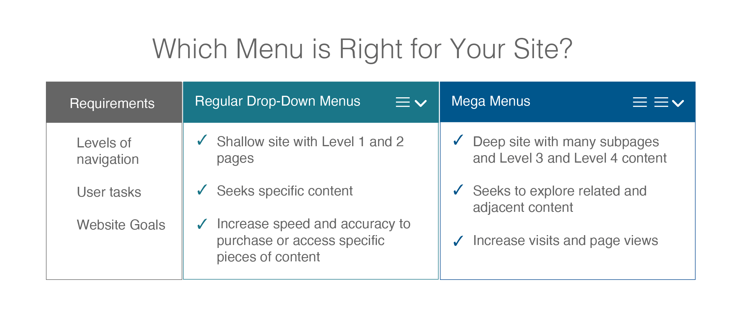
Which Menu is Right for Your Site?
Requirements
- Levels of navigation
- User tasks
- Website Goals
Regular Drop-Down Menus
- Shallow site with Level 1 and 2 pages
- Seeks specific content
- Increase speed and accuracy to purchase or access specific pieces of content
Mega Menus
- Deep site with many subpages and Level 3 and Level 4 content
- Seeks to explore related and adjacent content
- Increase visits and page views
What are the Best Practices for Mega Menus?
Like all parts of a website design, there are some key things to keep in mind when implementing a mega menu. These will allow you to follow best practices, ensuring responsiveness and accessibility compliance.
- Responsive Design: Ensure the mega menu works well on all devices.
- Accessibility: Follow web accessibility best practices through keyboard operability and ARIA roles.
- Simplicity: Keep the menu simple with a clear visual hierarchy.
- Interaction: Design the menu to open on click to reduce accidental activation.
- Performance: Optimize for quick load times.
- Consistency: Maintain consistent design and behavior throughout the menu.
How Content Administrators Benefit from Mega Menus
As we've already shown, end users experience many benefits from mega menus, but what about content administrators, especially those overseeing large sites like professional associations?
A mega menu helps content creators beyond just accommodating more pages quickly in the IA structure. They can:
- Improve Content Organization: Maintaining an organized and intuitive site structure is easy since content is grouped into categories and subcategories.
- Increase the Flexibility when Adding New Content: With a mega menu, the site’s structure can grow without overwhelming users.
- Reduce Content Silos: By presenting related content together, mega menus help avoid silos, encouraging users to explore different sections of the site and discover more content. This creates more cross-linking opportunities, improving content visibility.
- Update Content Easily: A well-structured mega menu can be updated quickly as content priorities shift or new sections are added, offering a dynamic way to keep the site’s navigation aligned with evolving goals or campaigns.
- Create a Consistent User Experience: As new pages are added, the mega menu ensures a consistent navigation experience, reducing the cognitive load for users and allowing content creators to maintain a logical flow throughout the site.
These benefits make mega menus an excellent tool for content creators looking to build and scale a site’s structure while maintaining ease of use and content discoverability.
Taking the time to consider whether you should use a regular menu or a mega menu is an important part of the user experience. It will help users orient themselves quickly and easily, follow web accessibility best practices, and enable the site to grow as more content is created.
If you or your team are concerned about your current website navigation structure, reach out. Our UX team is happy to help review your site and give recommendations.