
10 Best Association Websites for Inspiration

SUMMARY
As association sites have continued to become the most vital “front door” to the organization’s digital experience, assets, research, and community, we’ve rounded up the best association websites that can be used to inspire new ideas through the use of smart, strategic UX design.
Table of Contents
- Best Branded Experiences
- Great Navigation Examples
- Rich Education and Career Path Experiences
- Robust Event Examples
What Makes For a Standout Association Website?
For many professional associations, their website is a platform for connection, education, event promotion, and brand expression. Yet, all too often, association websites are overwhelmed by huge and deep navigations, buried content, and outdated user experiences that fail to meet the needs of their current and future members.
To inspire future website updates, refreshes, and redesigns, we collected 10 standout examples that tackle common association needs and challenges. These examples span diverse industries and are grouped by four core areas where most association websites struggle: brand experience, navigation, education and career path, and events.
Whether you’re wondering how to design a more intuitive site for your users or improve member engagement, the examples below offer great inspiration.
Best Branded Experiences
Many professional associations have a brand that was first created for print. Translating these brand elements to a digital experience can be a challenge. You need to make sure the brand feels fresh and contemporary while reflecting the needs of all your users. You also need to evaluate the brand for accessibility while considering how to add microinteractions to bring the experience to life. Here are two of the best association websites that have created stronger and immersive branded experiences.
The Global Entertainment Marketing Academy of Arts & Sciences (GEMA)
GEMA (gema.org) is the premier nonprofit organization dedicated to recognizing and advancing excellence in entertainment marketing across film, music, sports, video games, and TV/streaming.
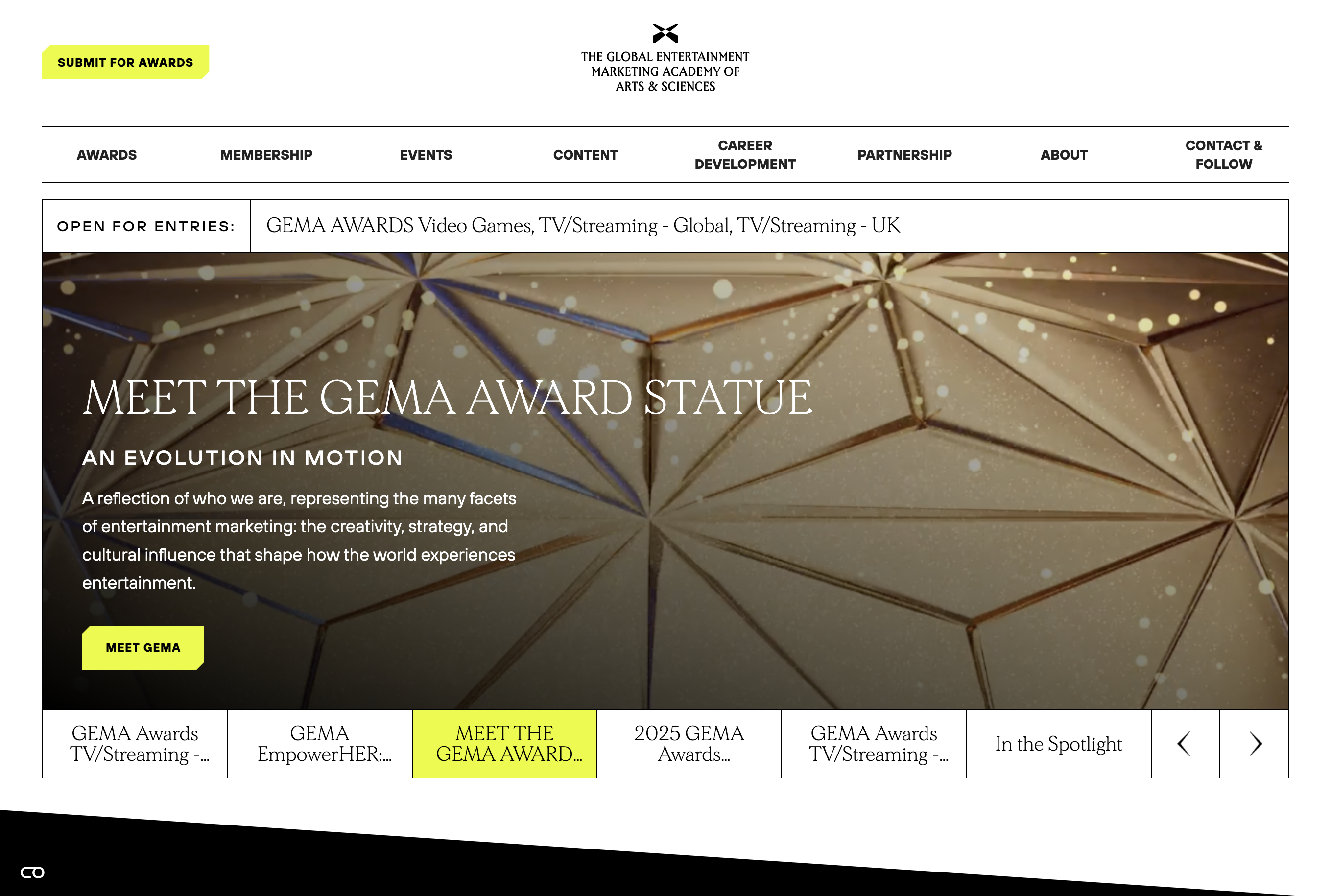
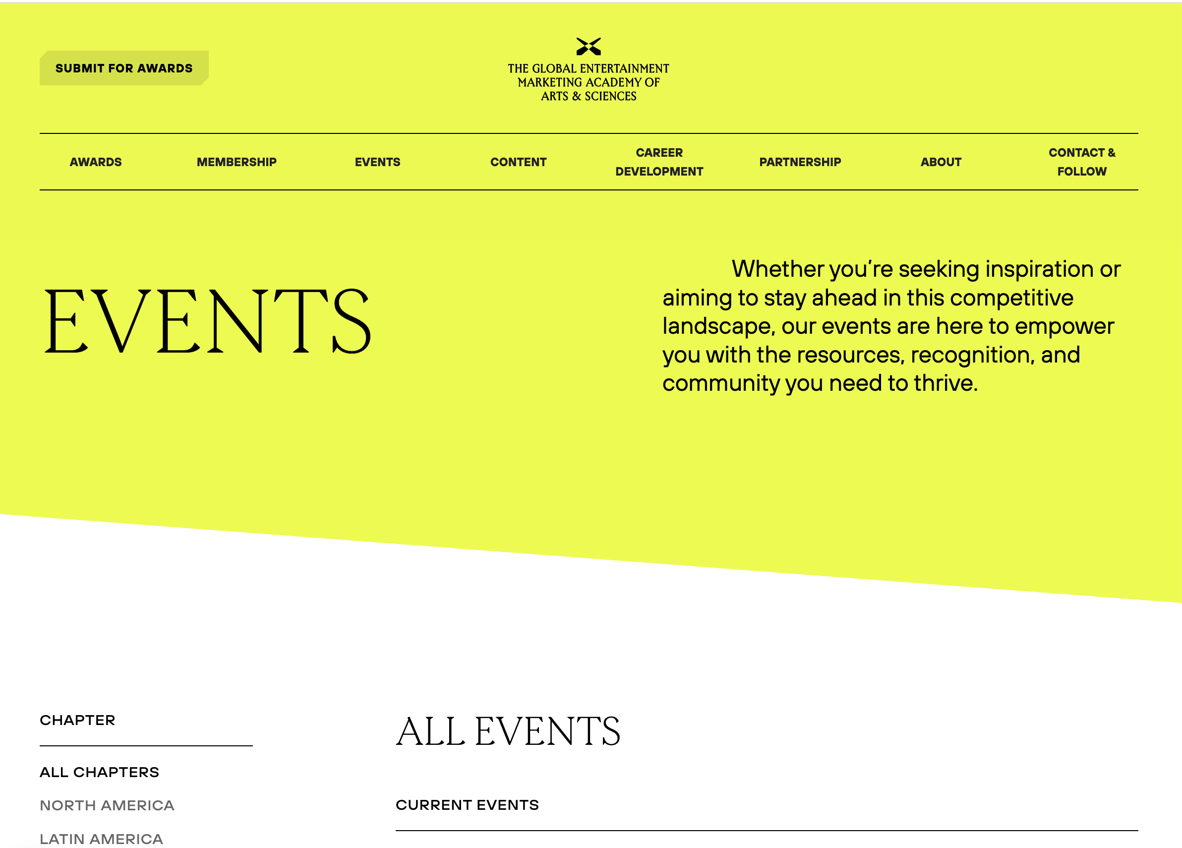
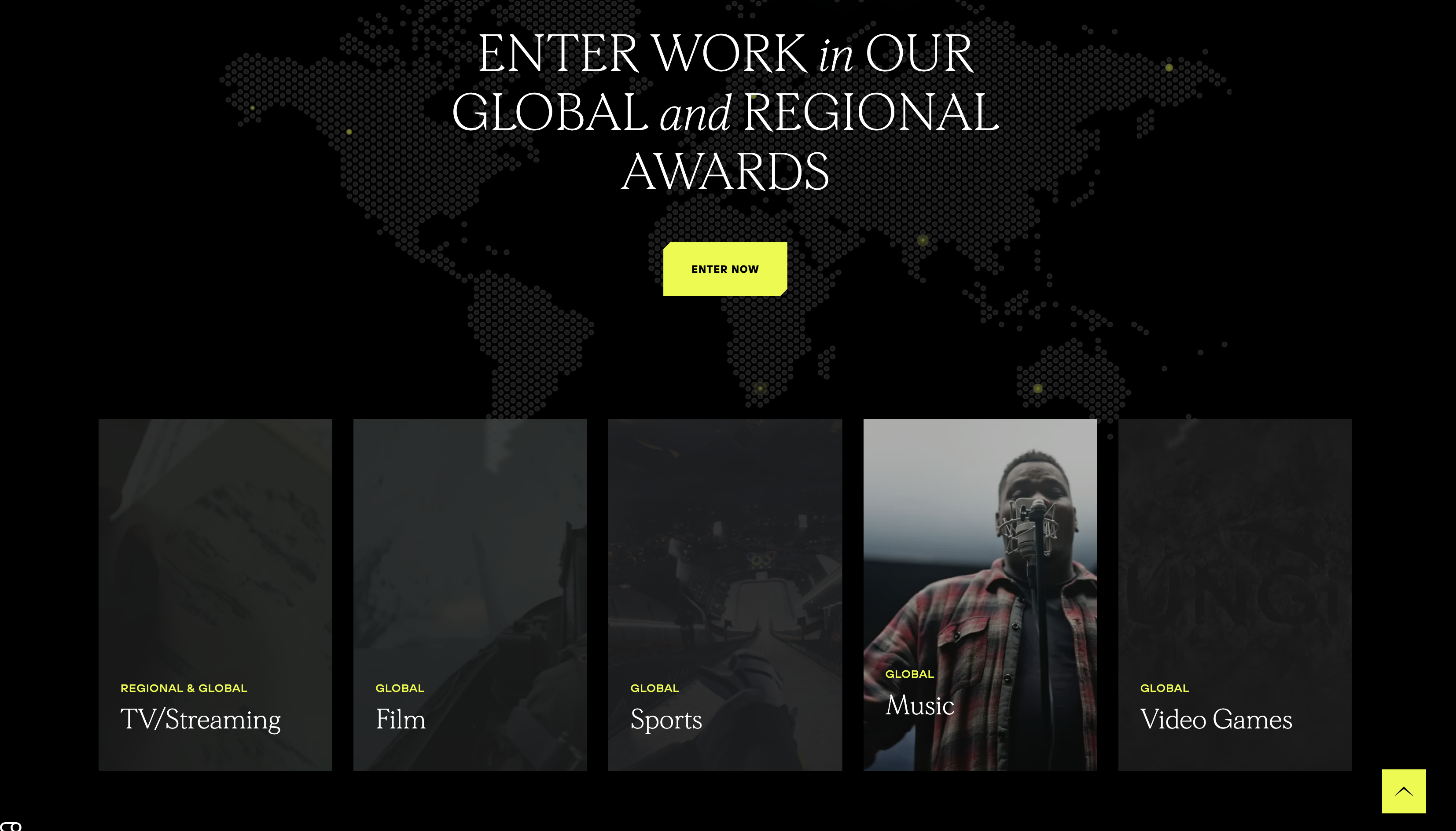
What we liked:
- The clean layout and typography with pops of yellow are engaging and feel contemporary
- The experience is very accessible via great color contrast and unique button hover states
- The structured elements, like the navigation and buttons, work well with the large areas of color and typography to create an immersive experience
- Subtle interactions like an interactive map and muted videos that become full-color on hover enhance the brand experience
National Association of Manufacturers (NAM)
NAM (nam.org) is the largest and most influential manufacturing trade association in the United States, advocating for pro-business policies and providing resources to strengthen the manufacturing industry.
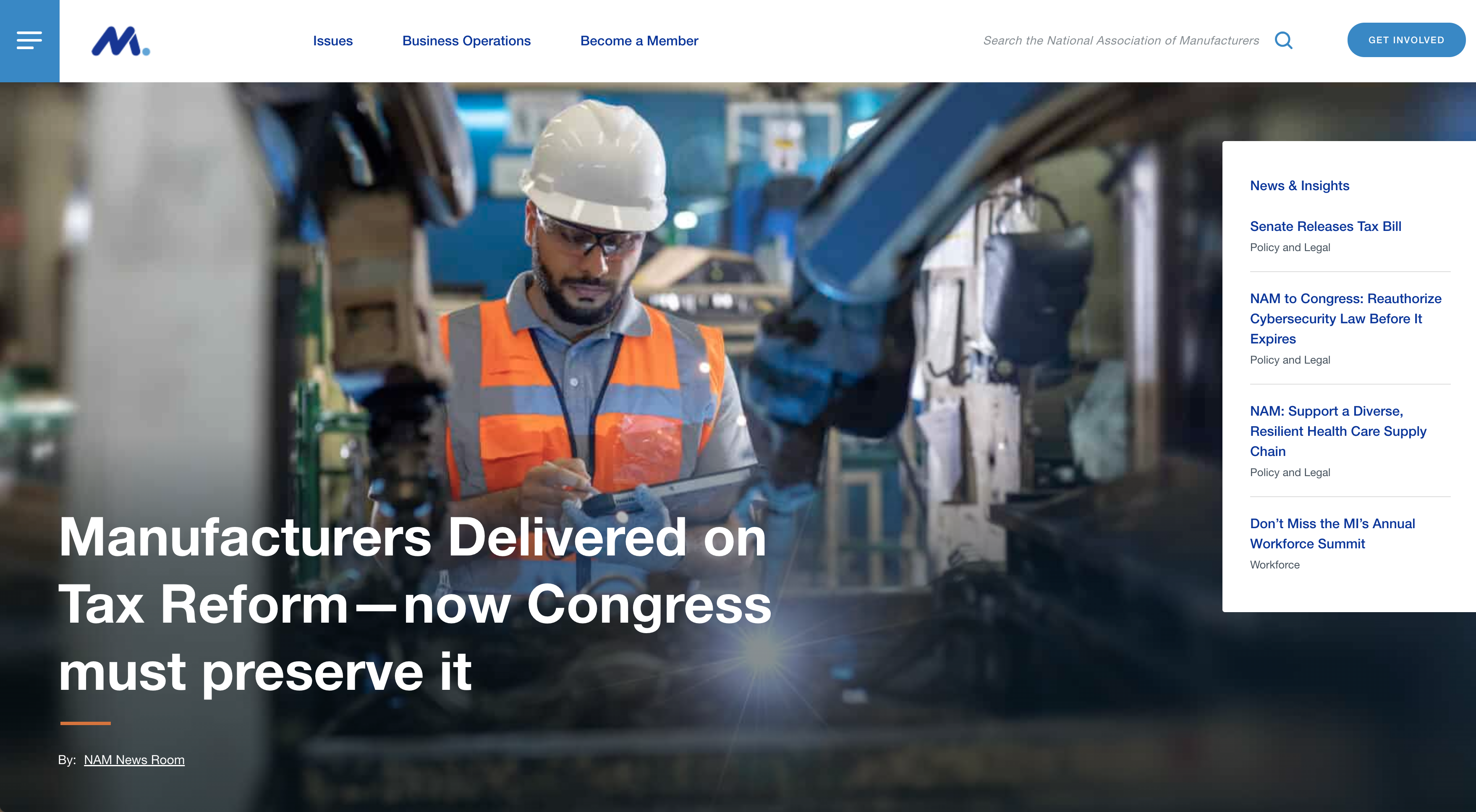
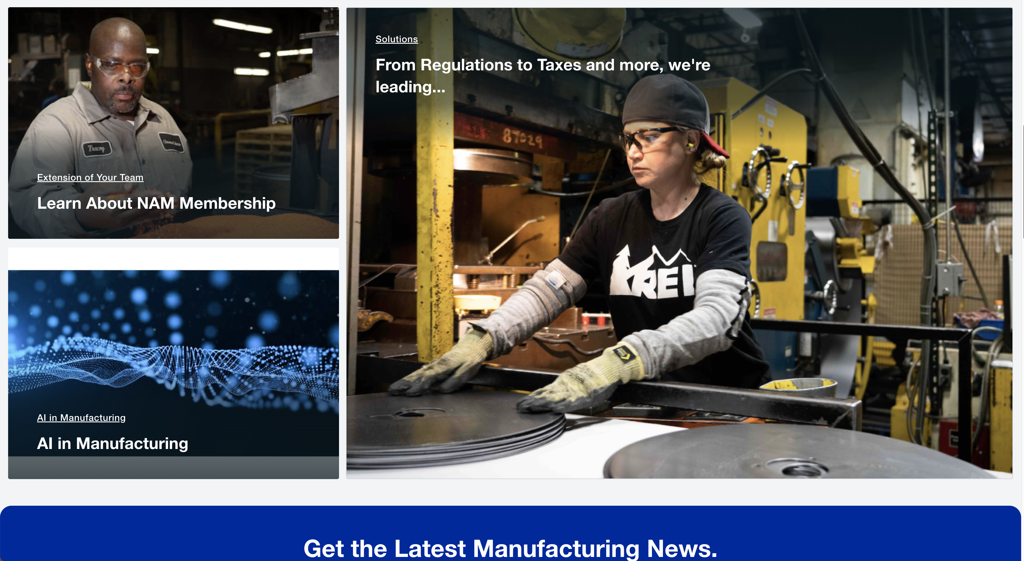
What we liked:
- The immersive hero area with relevant content is easily accessible
- Clean typography with pops of color
- Clean navigation that features the primary tasks users seek, and is high contrast for all users
- Content-specific images, including those of real members, are used to promote key content
Great Navigation Examples
We all know that association websites need to house a lot of content. After all, an association’s content is typically the most sought-after and utilized member benefit. However, if not carefully managed, a website can grow out of control over time, resulting in overloaded menus, confusing structures, and disjointed content silos. Here are three of the best association websites we think have very intuitive navigation.
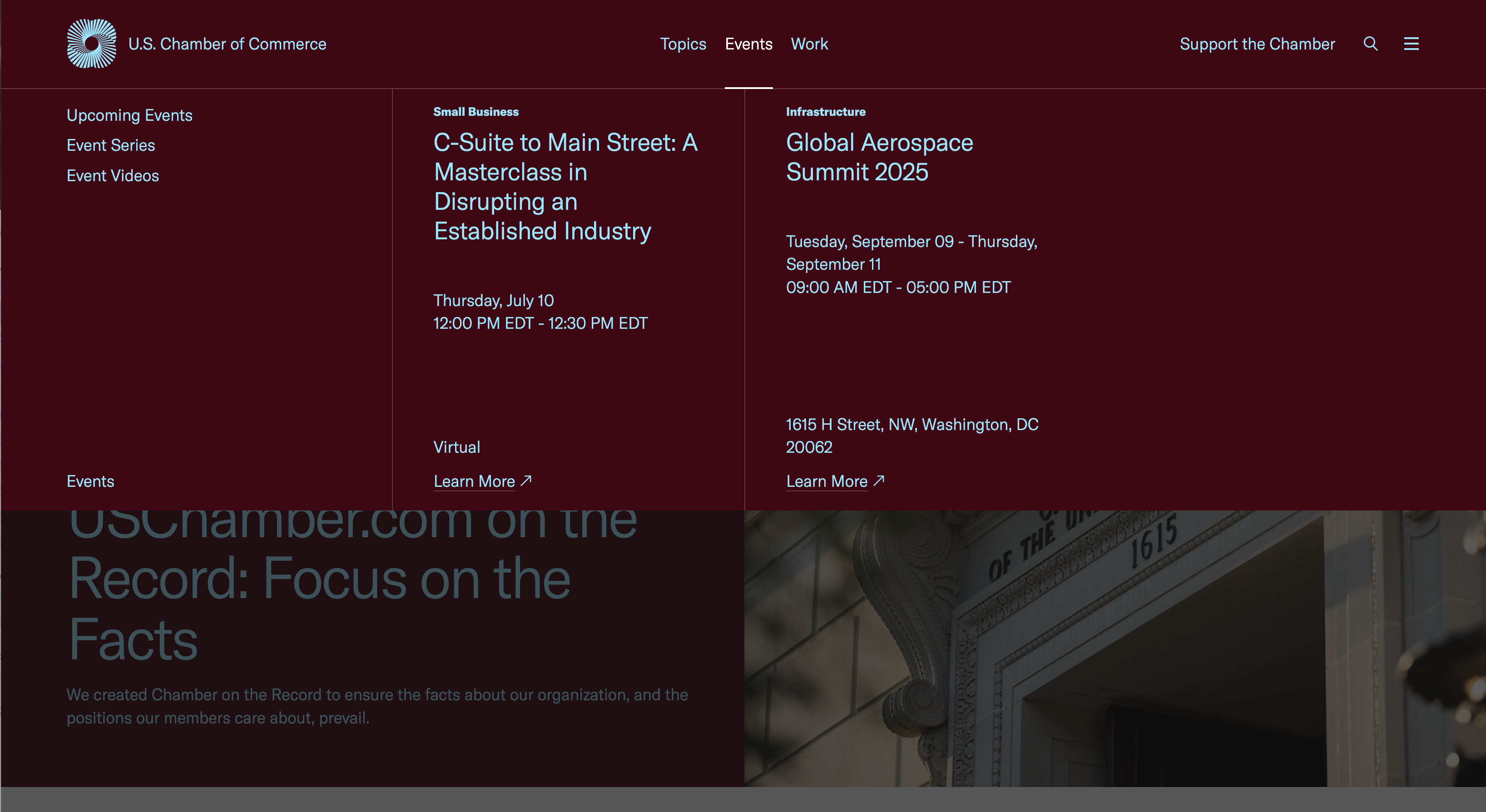
U.S. Chamber of Commerce
The U.S. Chamber of Commerce (uschamber.com) is the world’s largest business organization, representing companies of all sizes across every sector of the American economy.
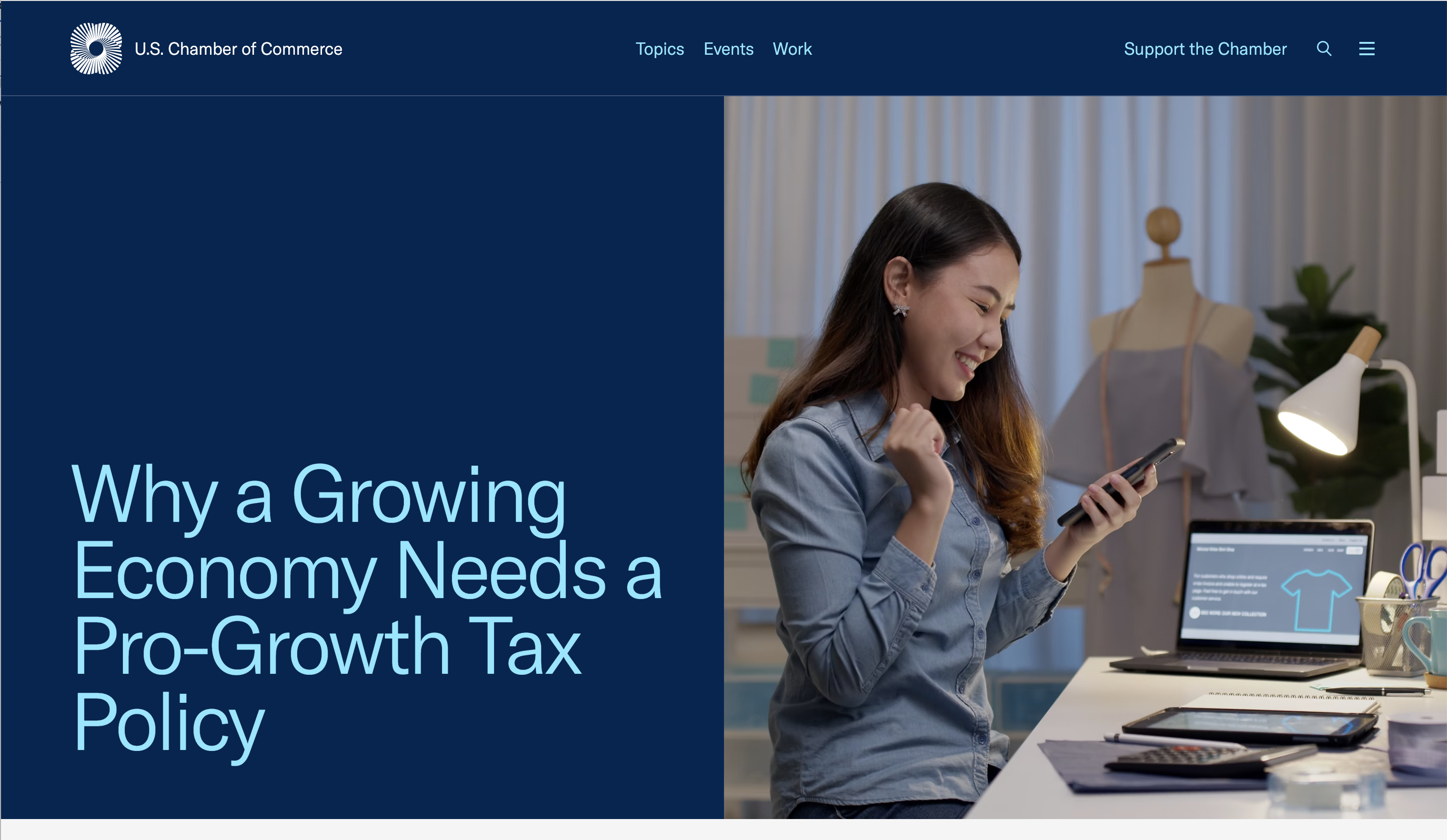
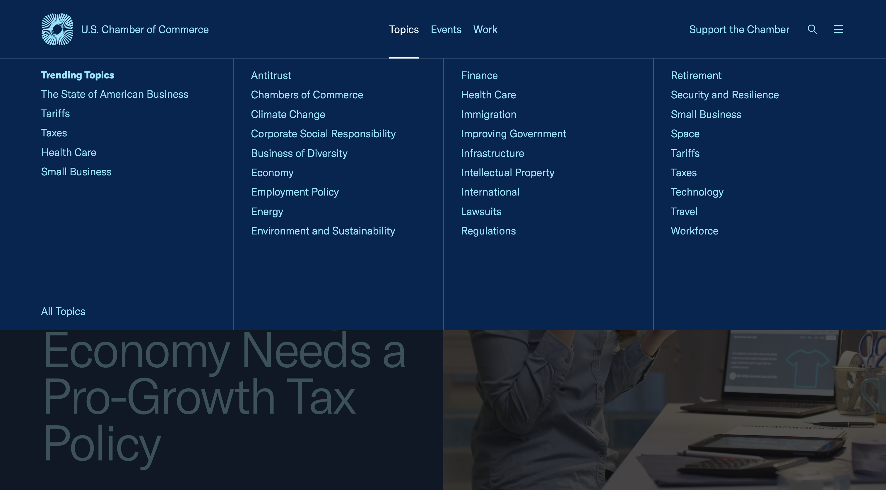
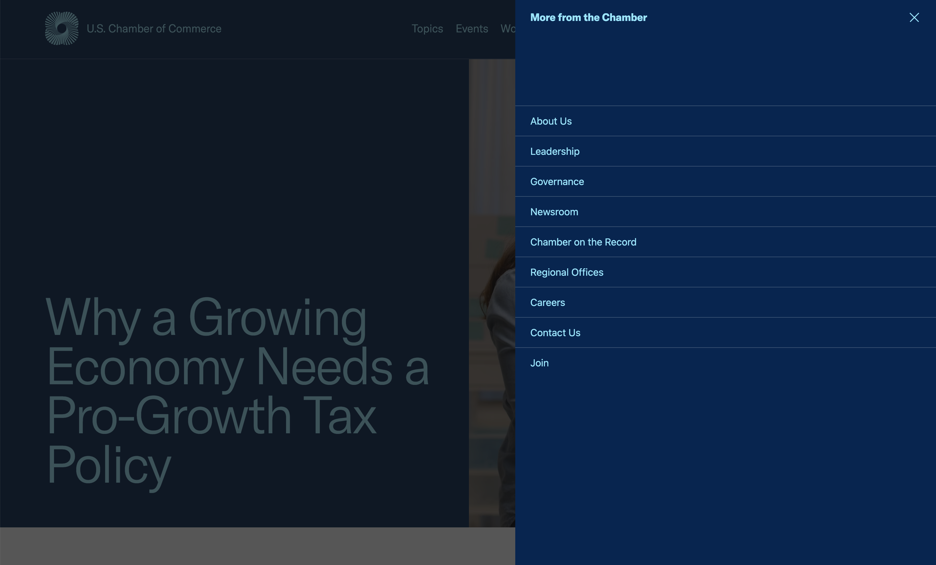
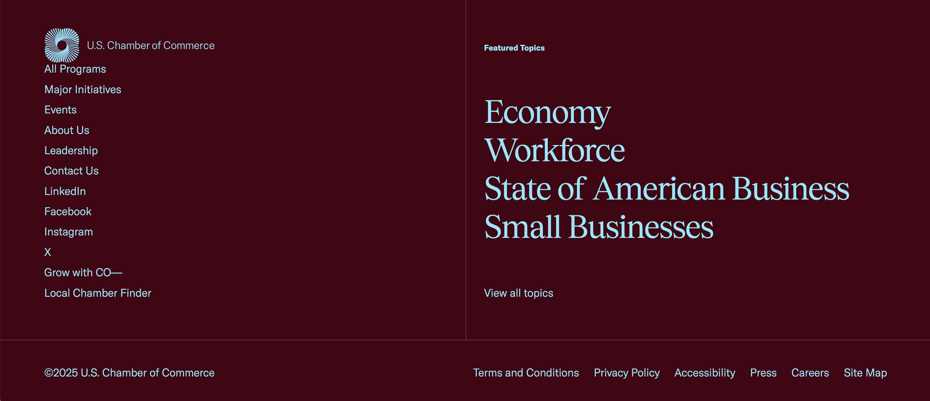
What we liked:
- The navigation has been streamlined to reflect the key tasks users want to do on the site
- The rest of the navigation is tucked away in a hamburger navigation, which is still accessible but not in the primary navigation
- The topics mega menu is easy to understand, with trending topics in the left column and all the other topics in alphabetical order for easy scanning
- At the bottom of each page, featured topics become part of the footer to help the user continue to navigate the site
The American Society for Clinical Pathology (ASCP)
ASCP (ascp.org) serves pathologists and laboratory professionals, focused on advancing laboratory medicine through education, certification, and advocacy.
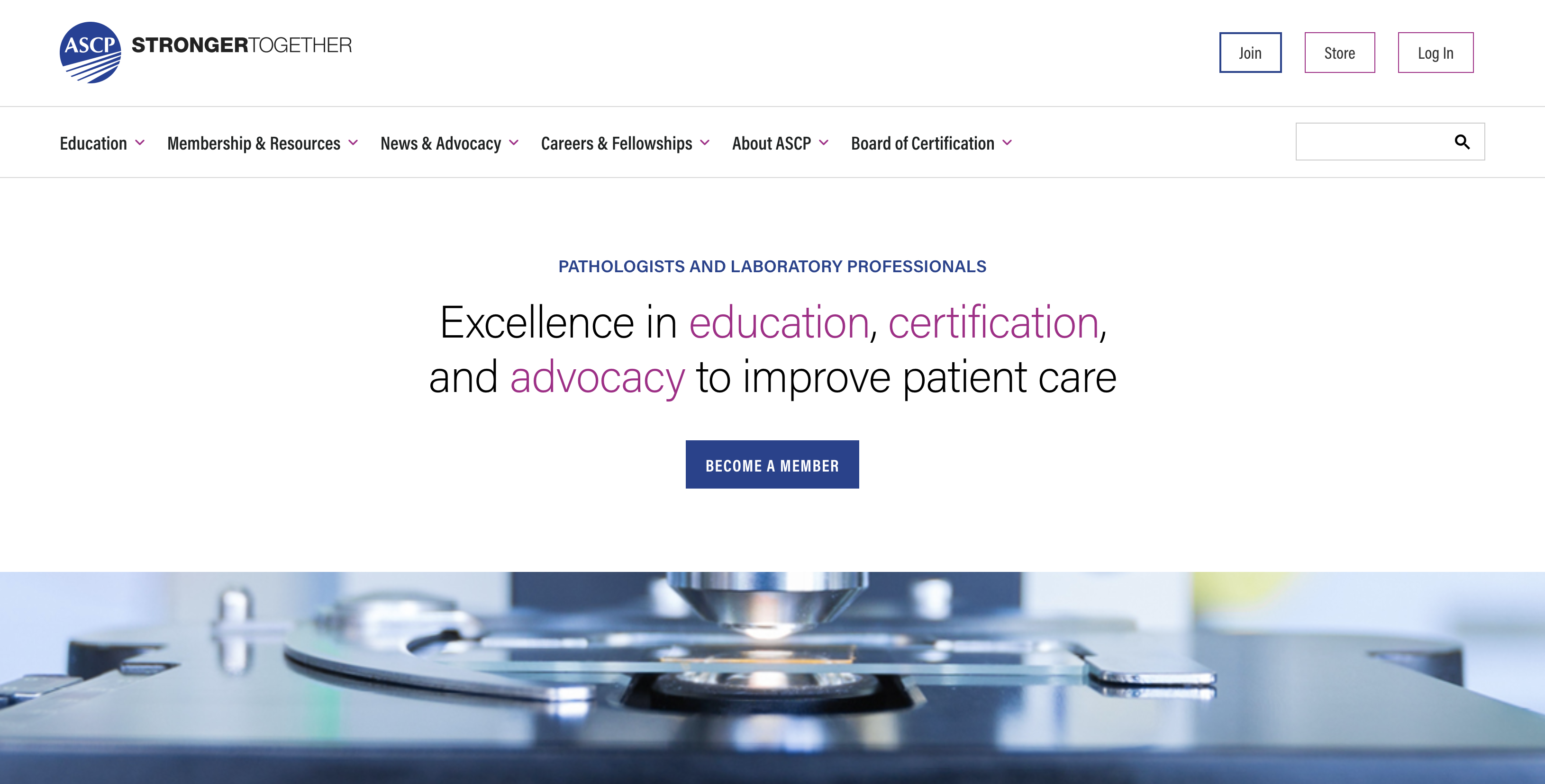
What we liked:
- The navigation is simple and concise with “Join,” “Store,” and “Login” being more visually prominent
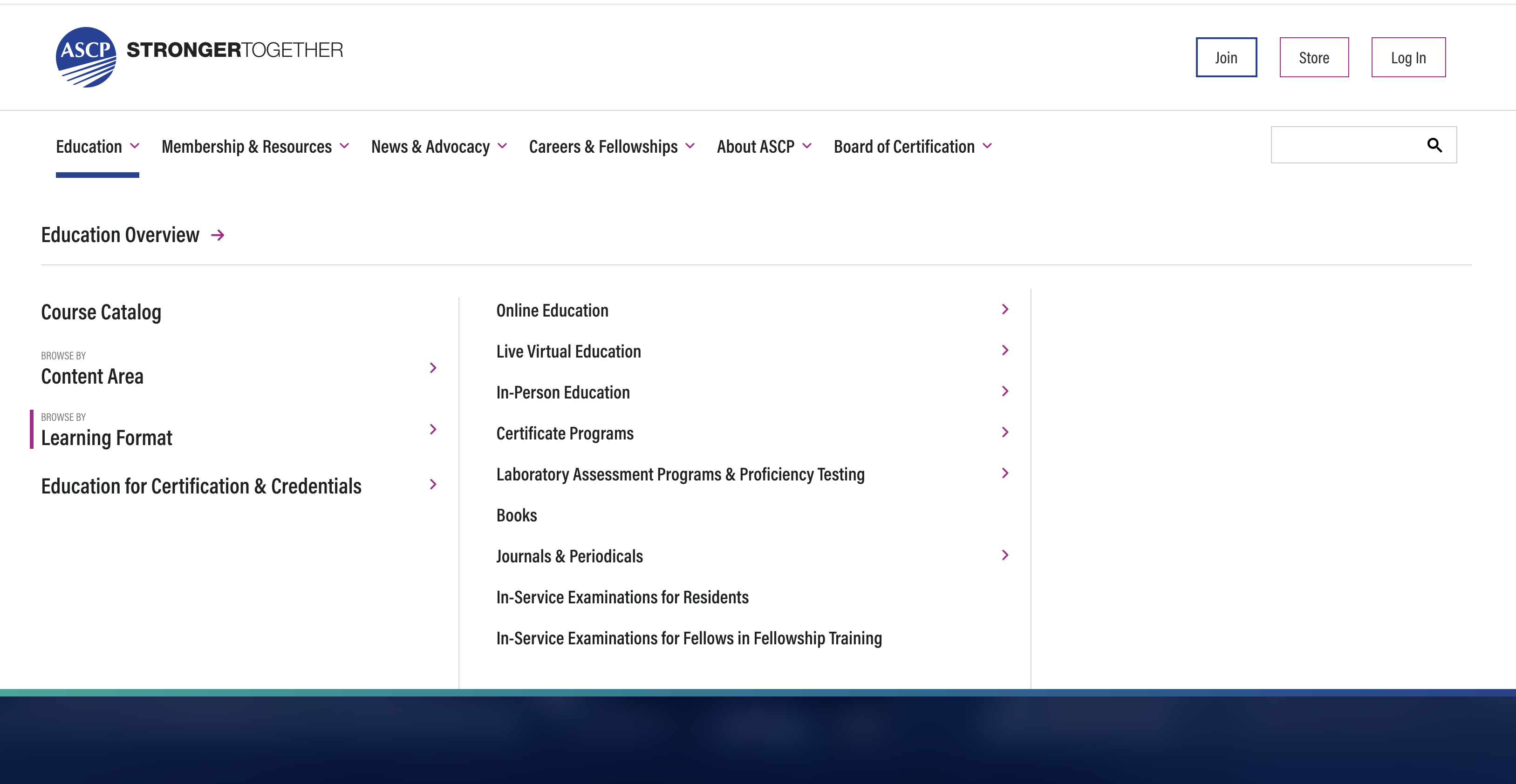
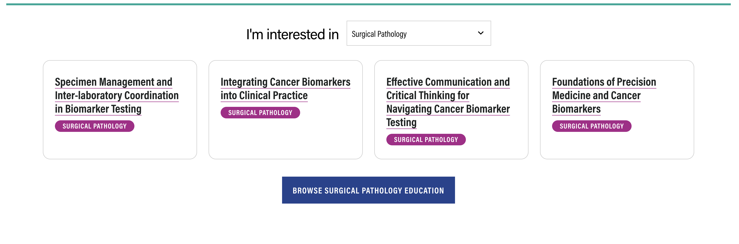
- The site is large and deep, so a mega menu is used
- Through the mega menu, a user can quickly and easily navigate to first-, second-, and even third-level pages. This is not a flyout menu, but instead a very accessible drill-down experience often seen on commerce websites
- In-page patterns help users find the content they seek by topic and type
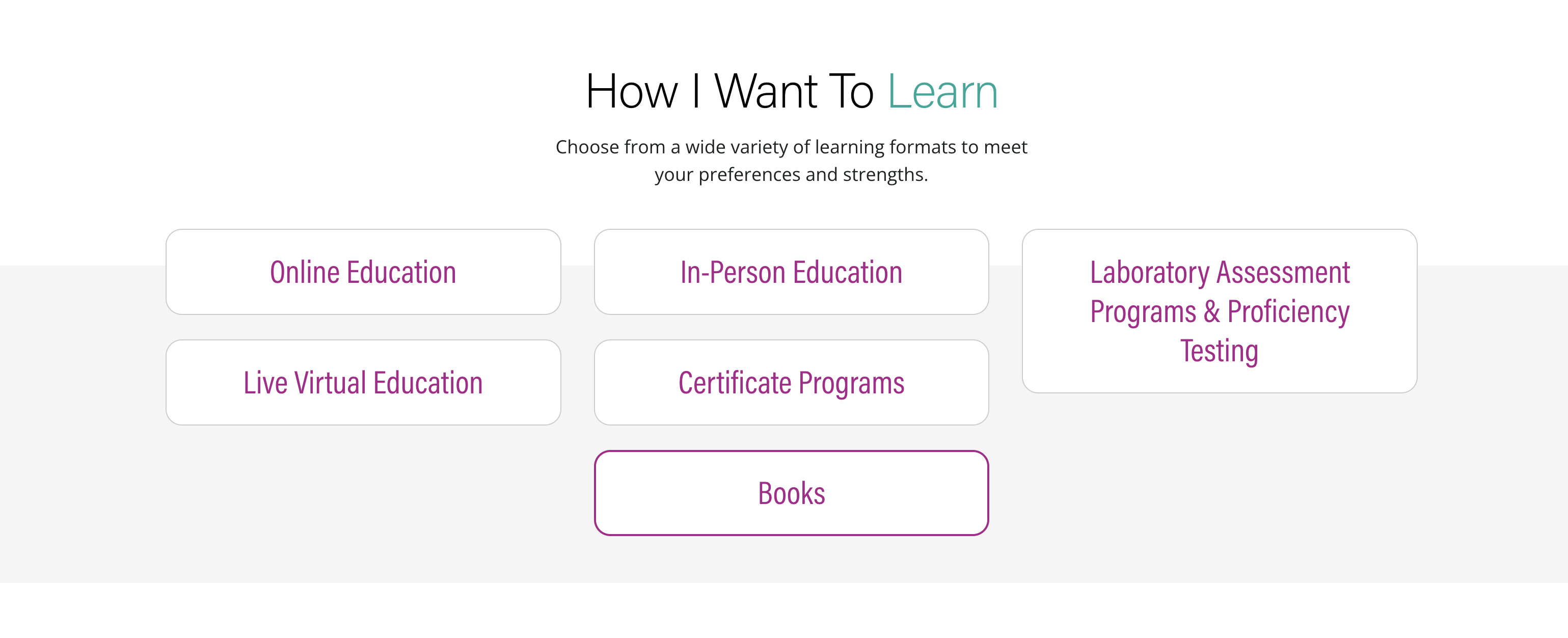
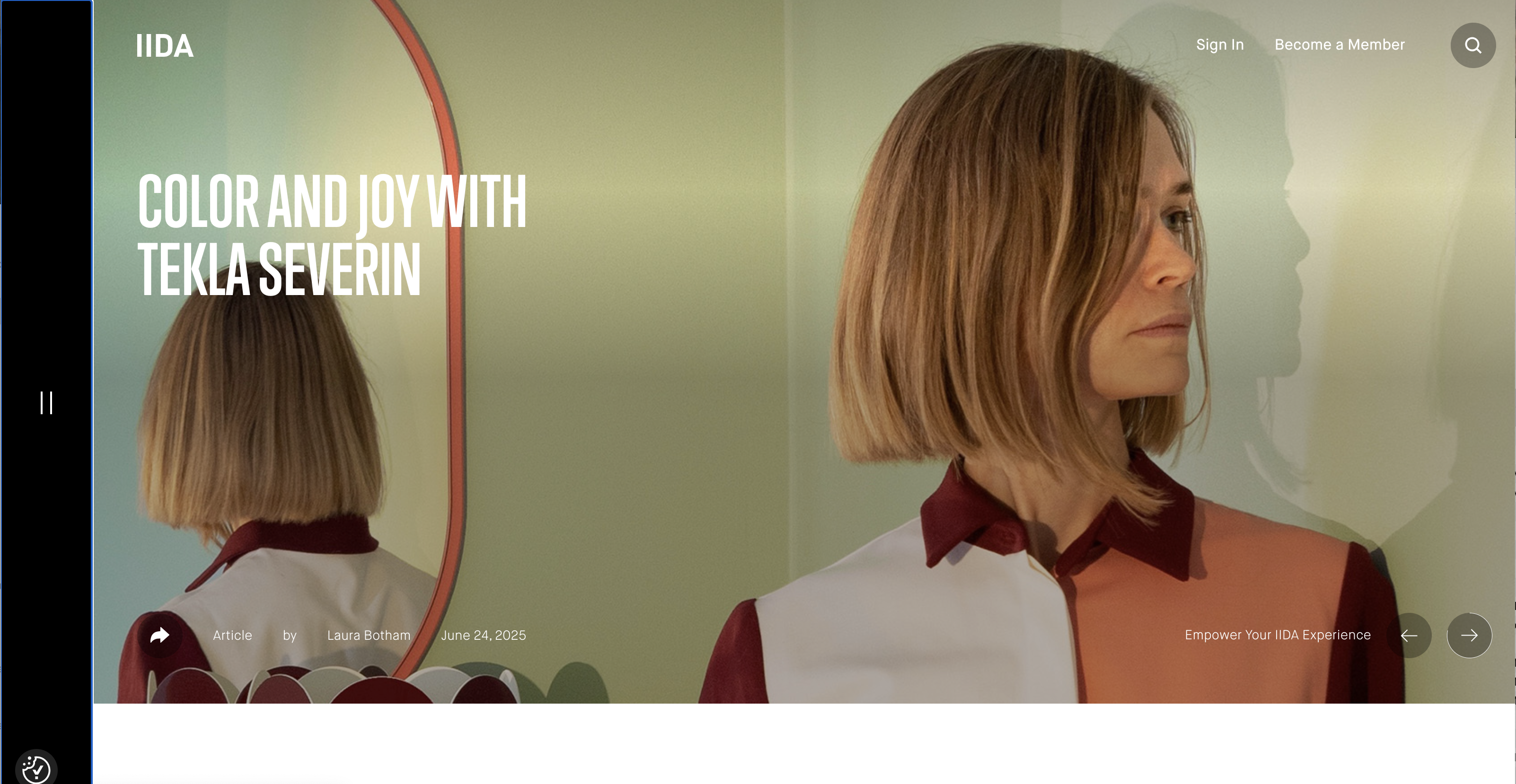
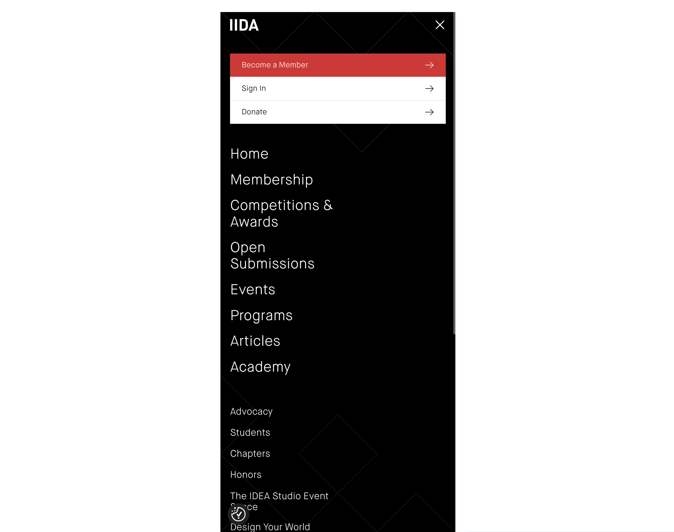
The International Interior Design Association (IIDA)
IIDA (iida.org) is a global organization that supports commercial interior designers through advocacy, education, and professional networking.
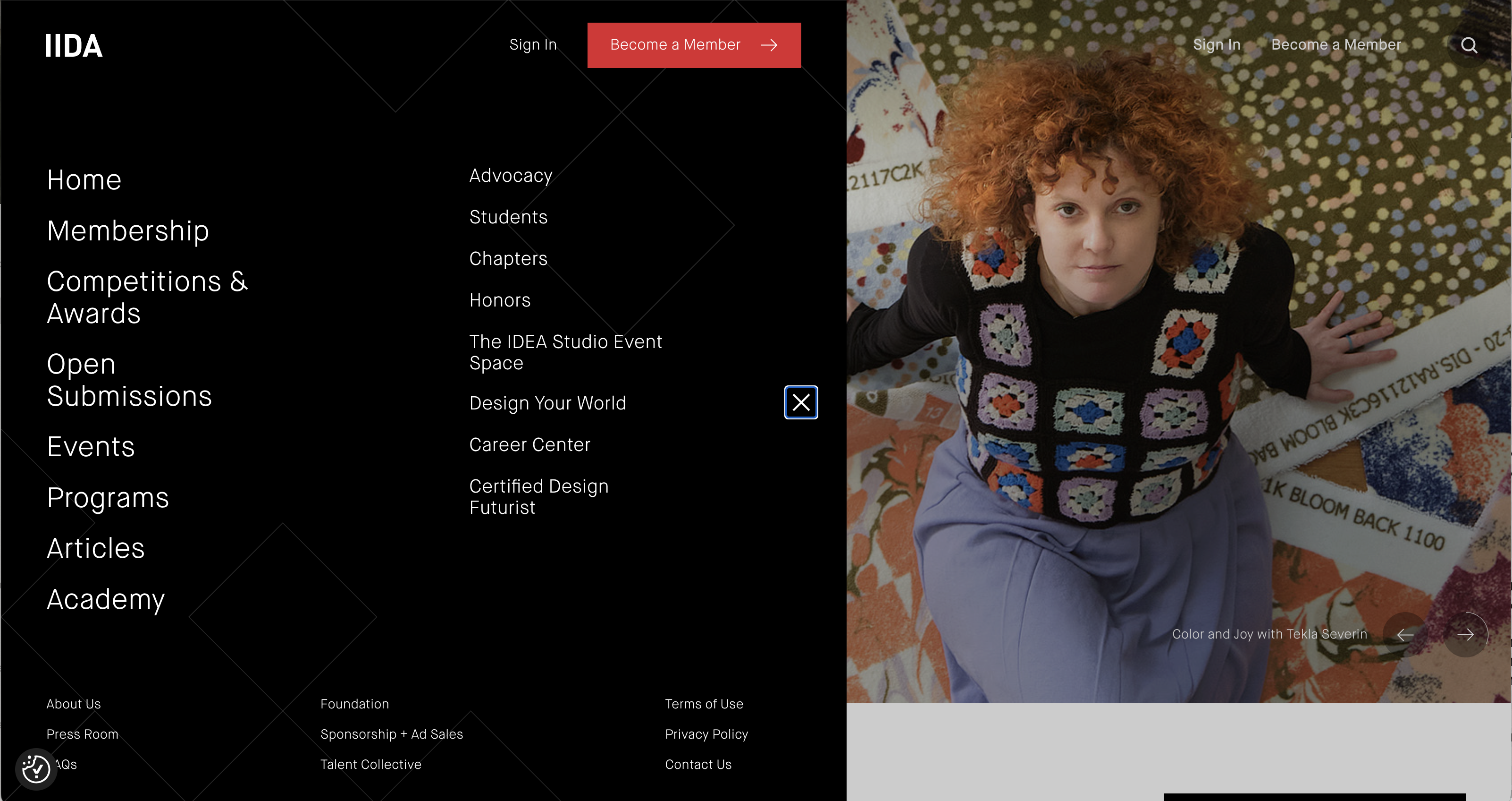
What we liked:
- A full-screen navigation menu appears from the left side of the screen
- All the primary items, secondary items, and call-to-actions are easily identified through visual hierarchy
- Key tasks like sign-in, become a member, and search are located outside the mega menu
- The experience is consistent on mobile, resulting in a cohesive experience
Rich Education and Career Path Experiences
Most association members join for resources and educational materials. These can be robust sections that are difficult to navigate. The content can also be hard to identify; how do uses know which course or resource is right for them? Here are three of the best association websites with robust education and career path experiences.
The American Society of Travel Advisors (ASTA)
ASTA (asta.org) is the leading trade association for travel advisors and agencies in the United States, advocating for the travel industry and promoting the value of professional travel planning.
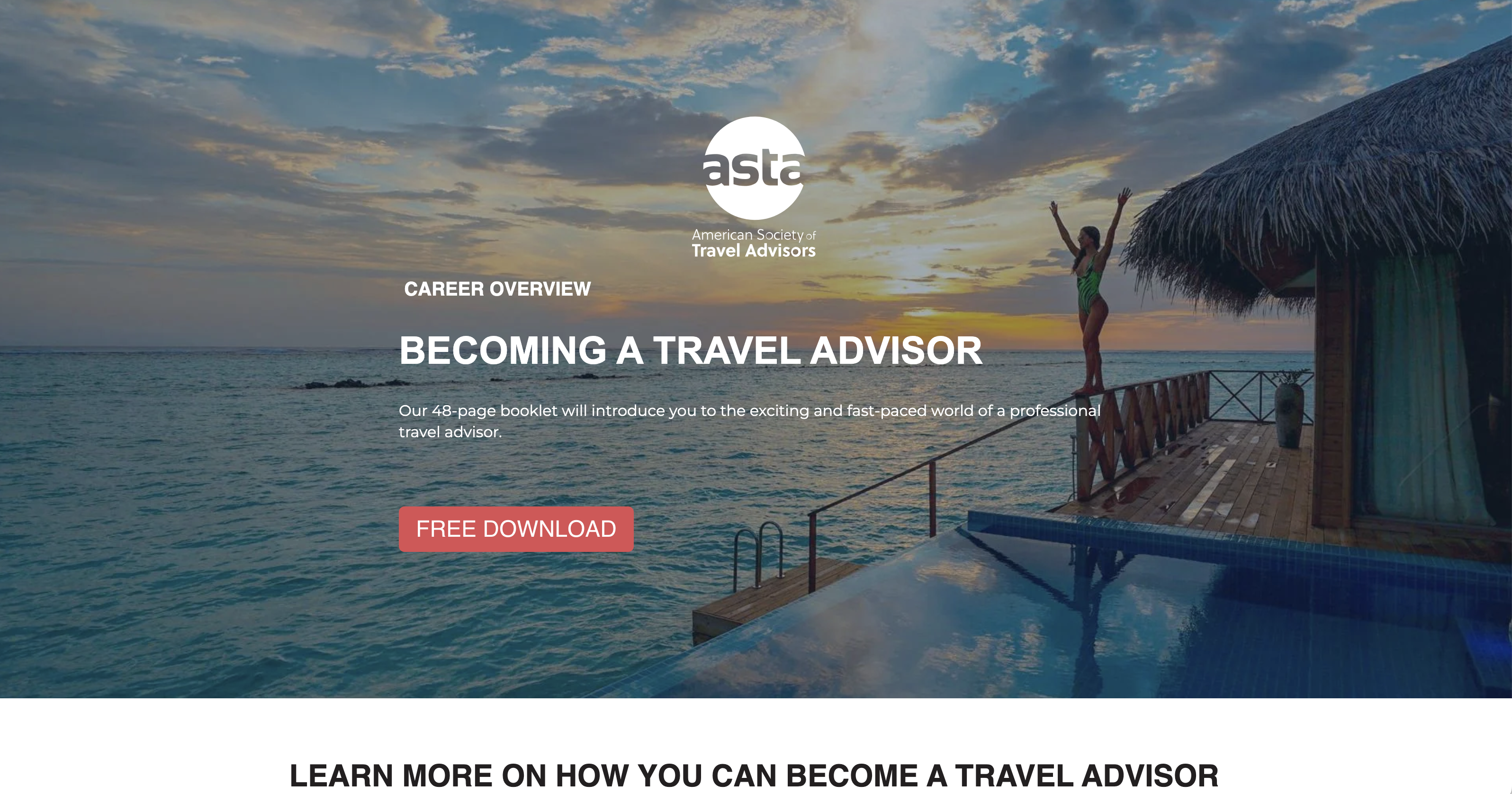
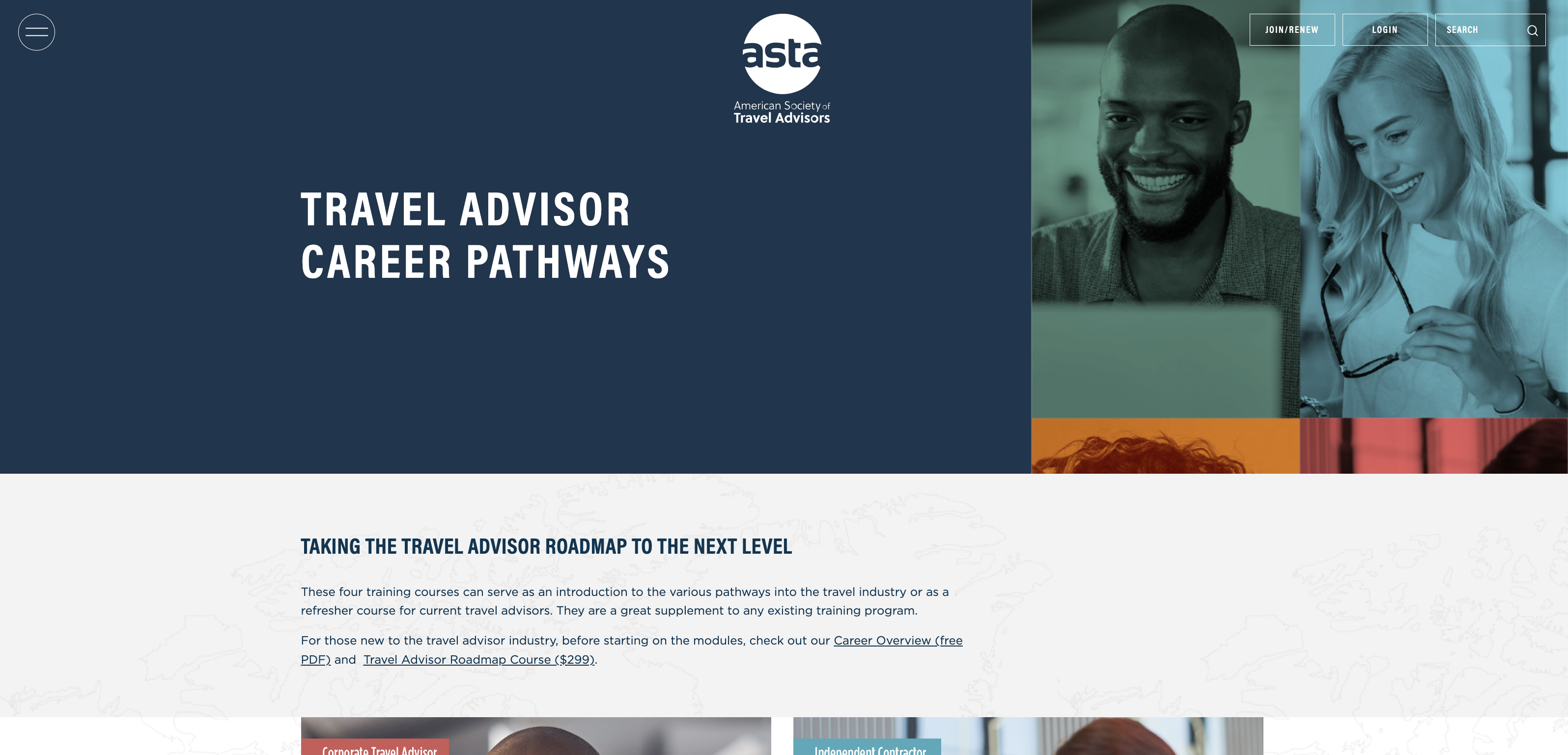
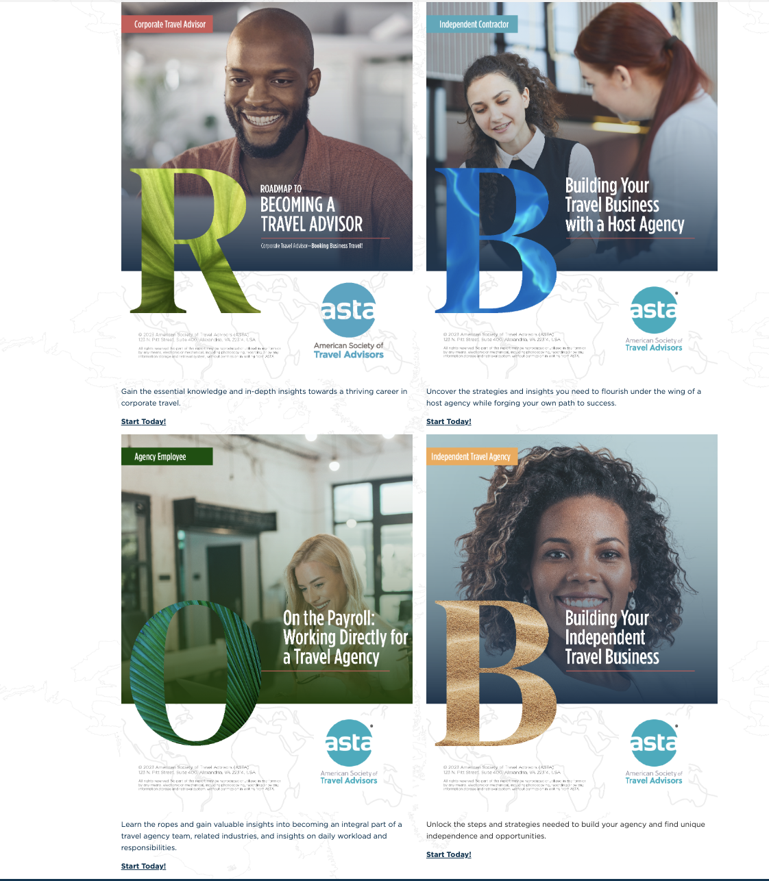
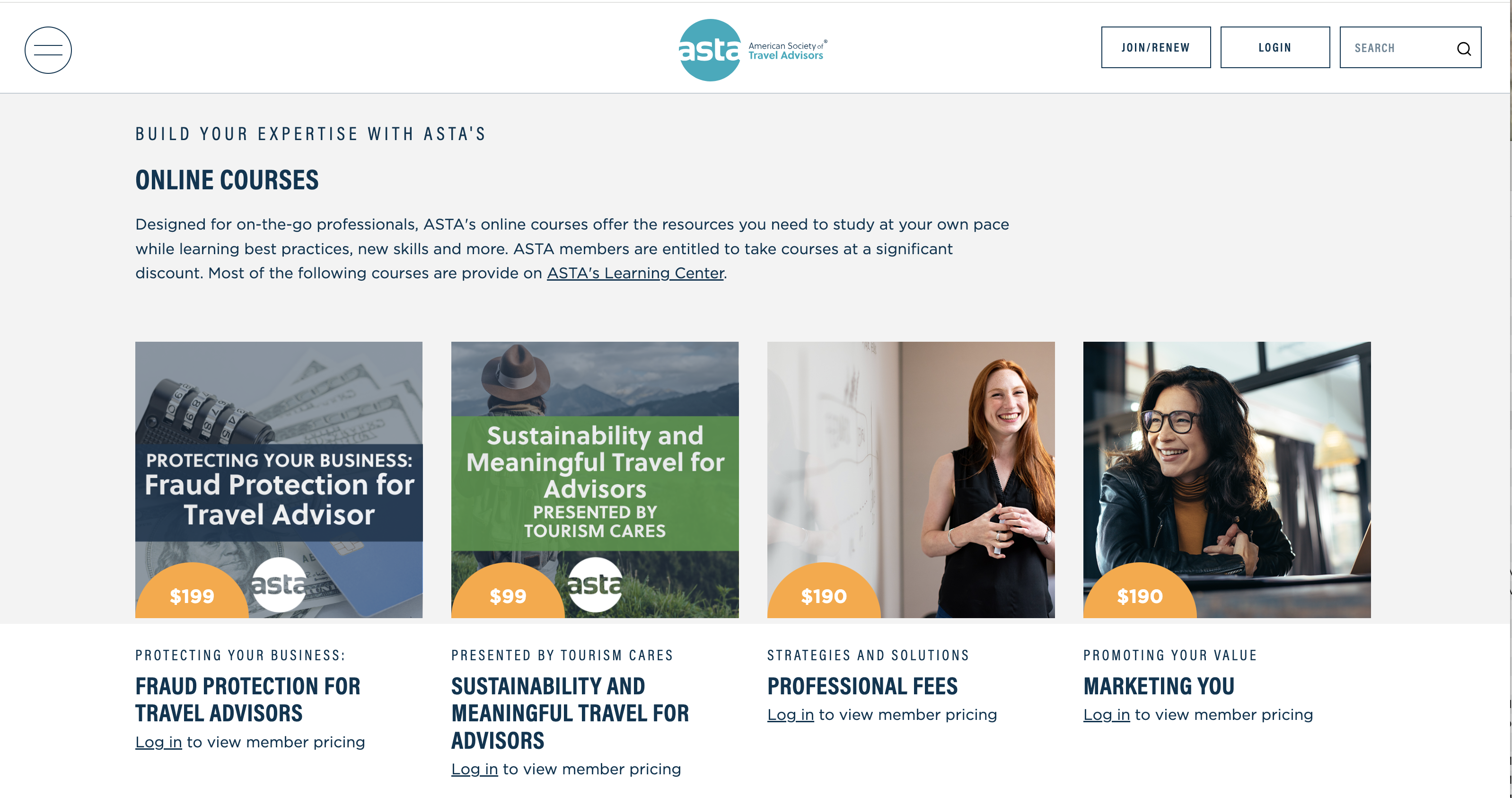
What we liked:
- The site includes career path content for users no matter where they are in their journey, even those first-time visitors just learning about the industry
- Additional content is presented to help users earn certifications to enhance their careers
- Education content is easy to read with title, price, and a CTA to log in being prominent
Society for Experiential Graphic Design (SEGD)
SEGD (segd.org) is a global multidisciplinary community of designers and professionals who create experiences through wayfinding, placemaking, and branded environments.
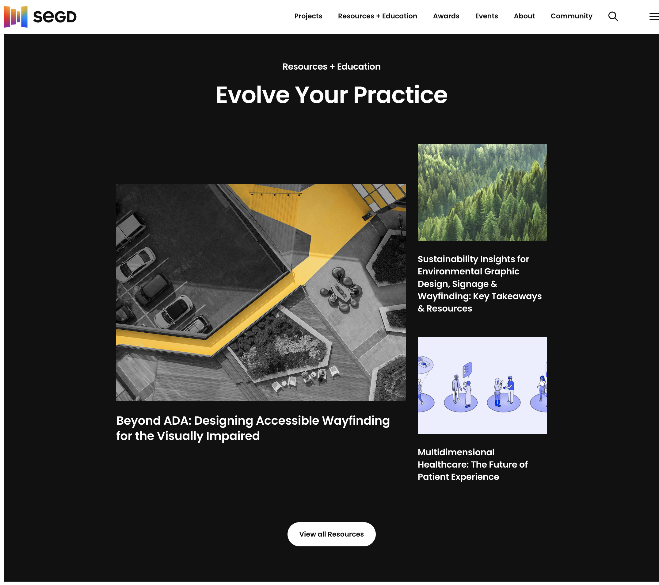
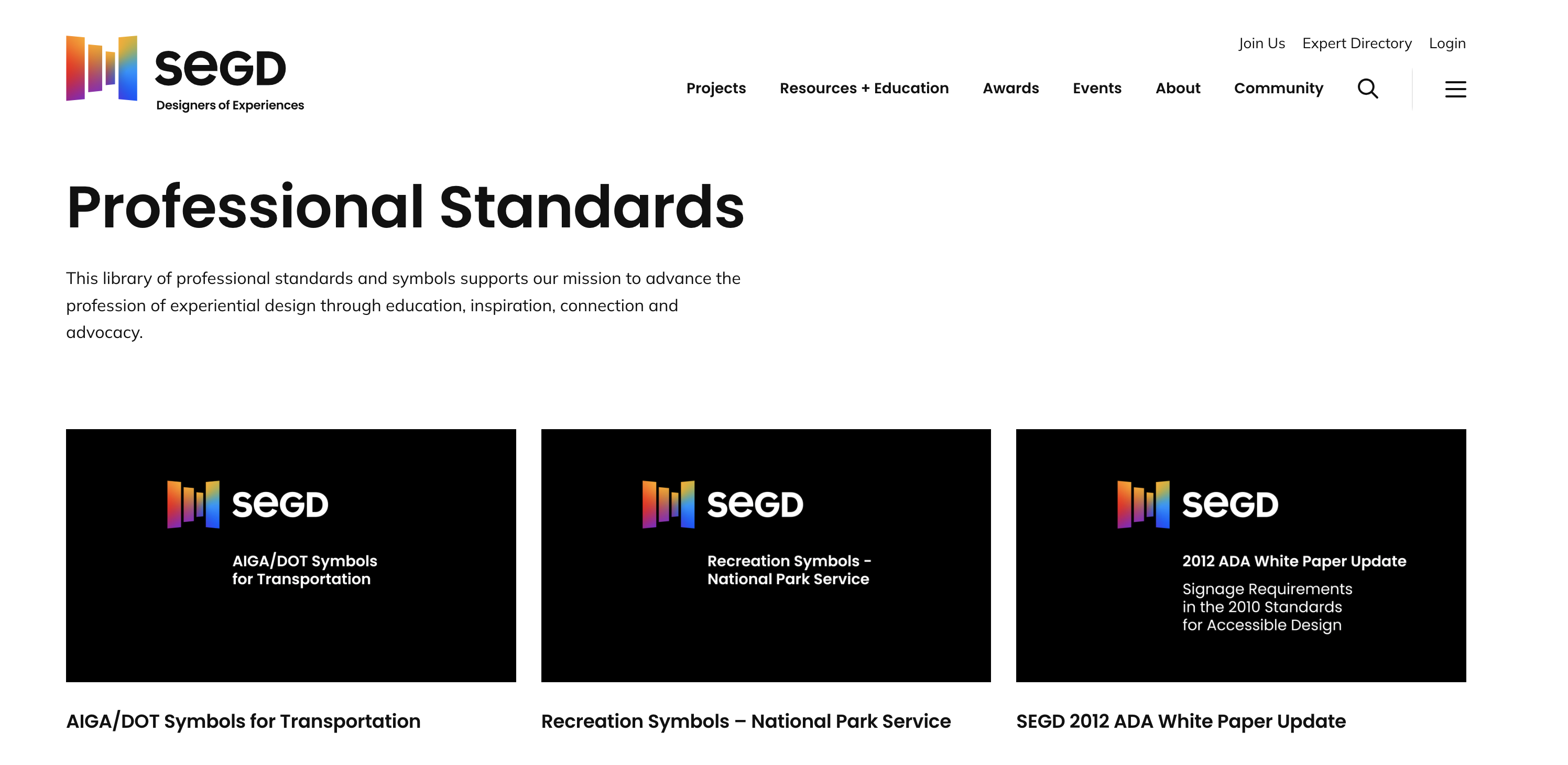
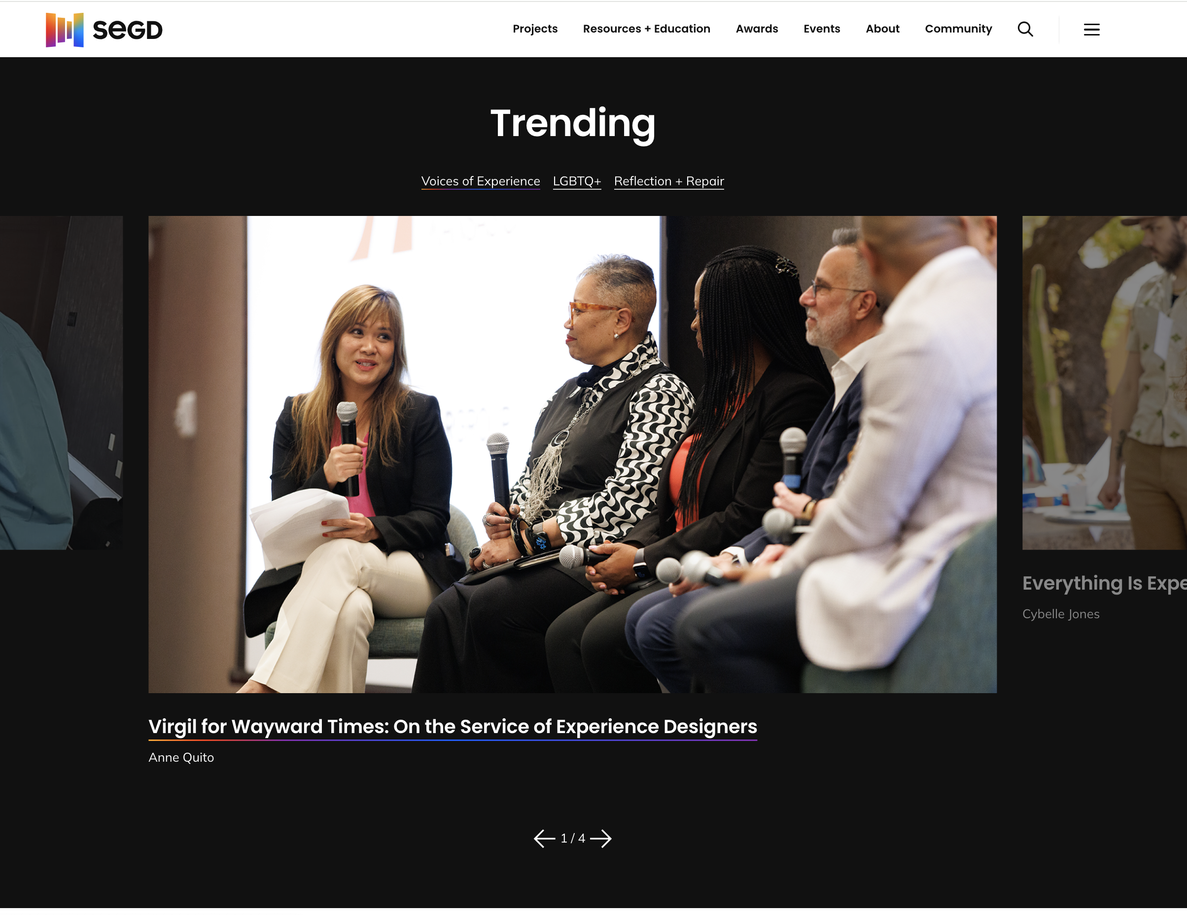
What we liked:
- Users can access resources and education immediately from the homepage via the navigation or a nicely designed pattern
- Resources are easy to read and understand
- Resources also include Voices of Experience, member-created content to share advice and best practices
Emergency Nurses Association (ENA)
ENA (ena.org) is dedicated to supporting emergency nursing through advocacy, education, research, and leadership development. It empowers emergency nurses to provide safe, high-quality care in fast-paced, critical settings.
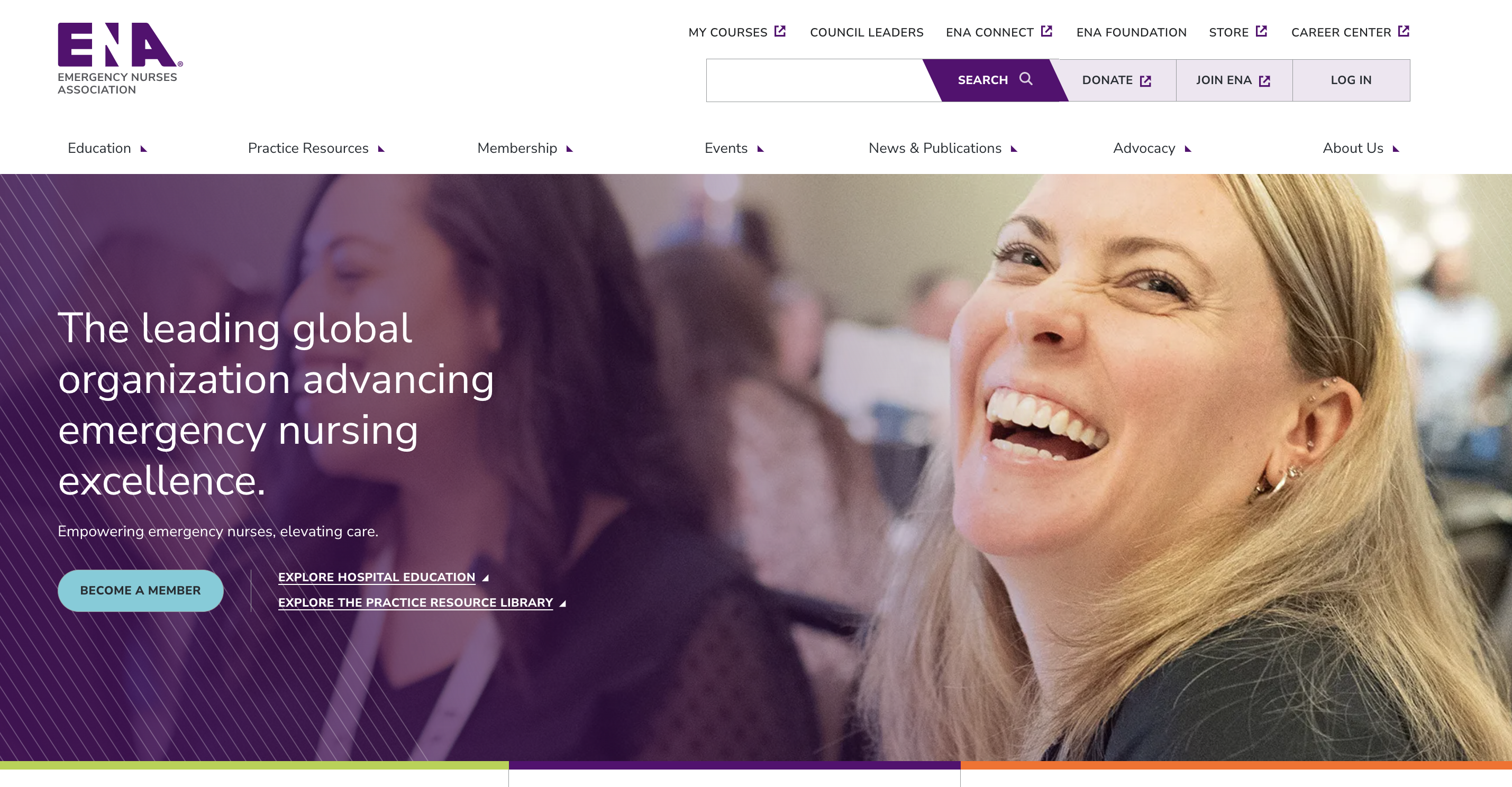
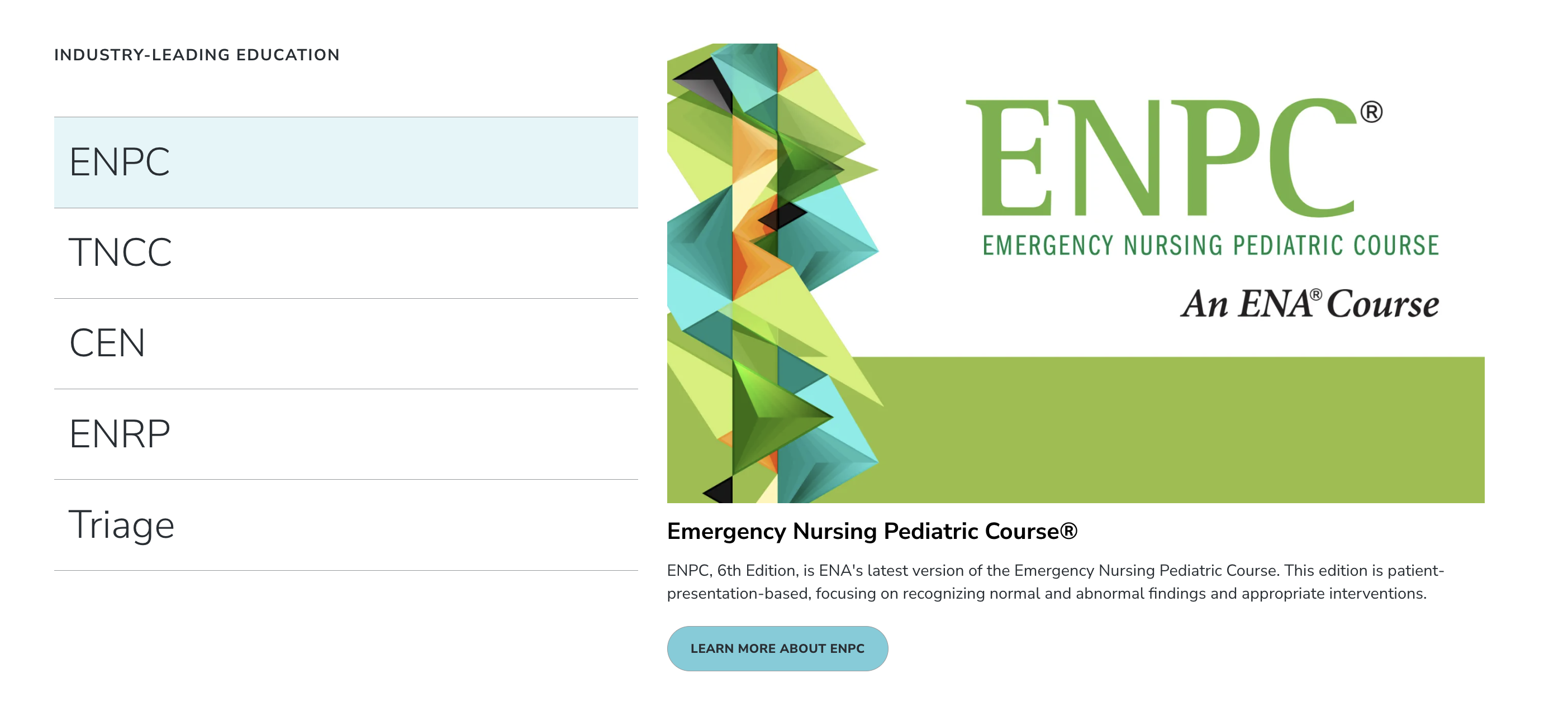
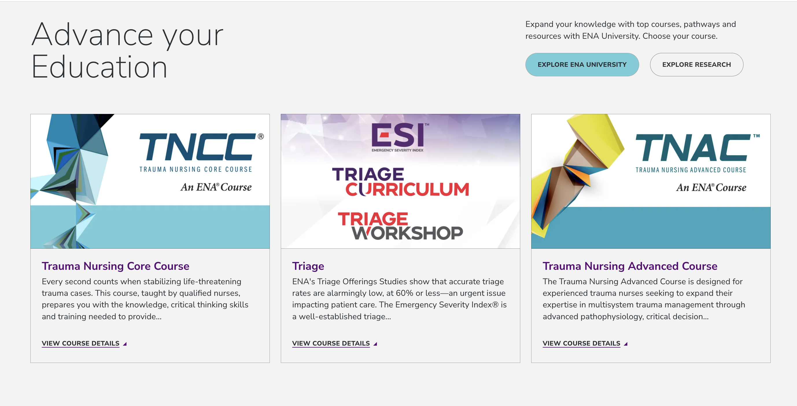
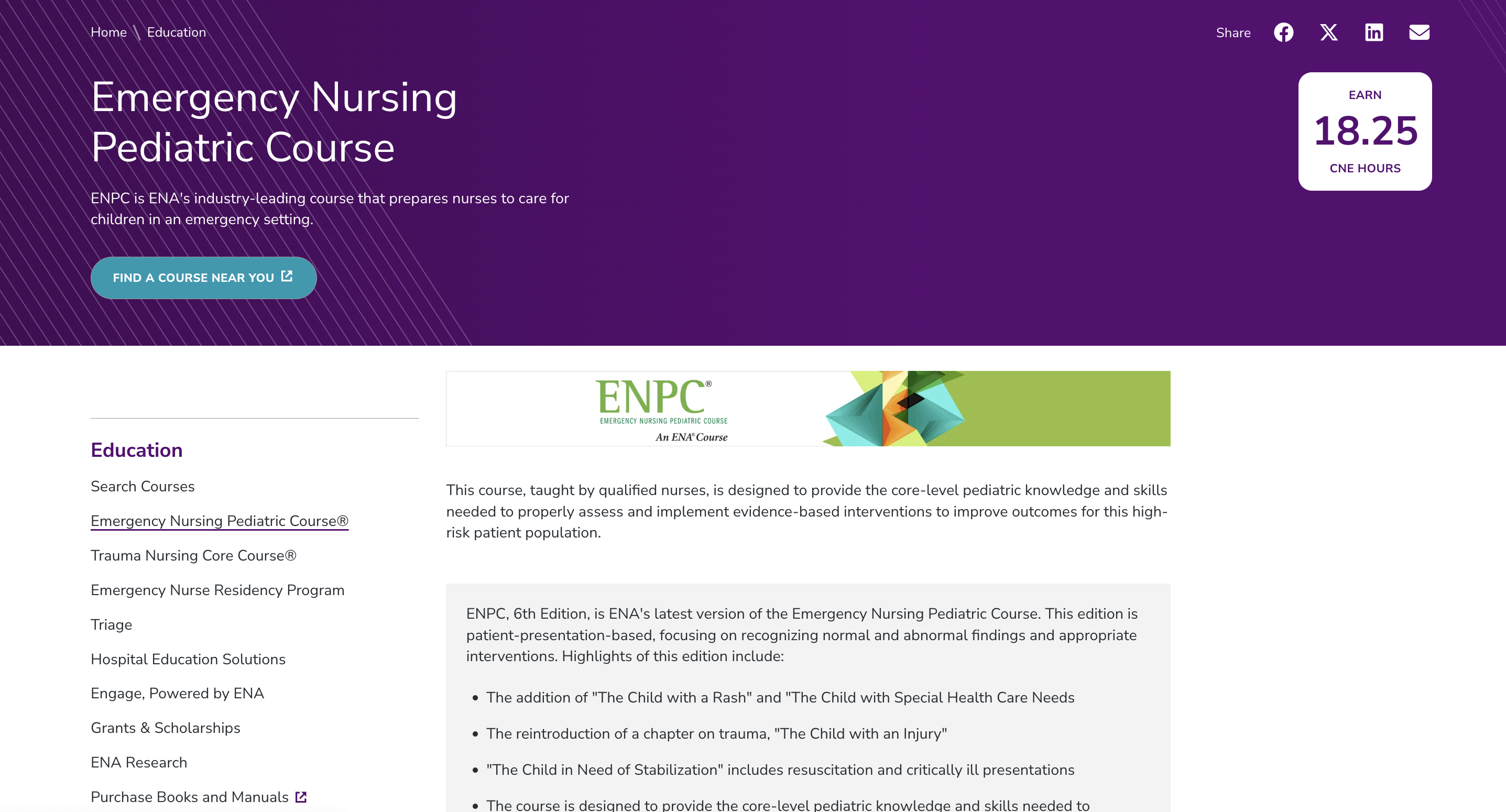
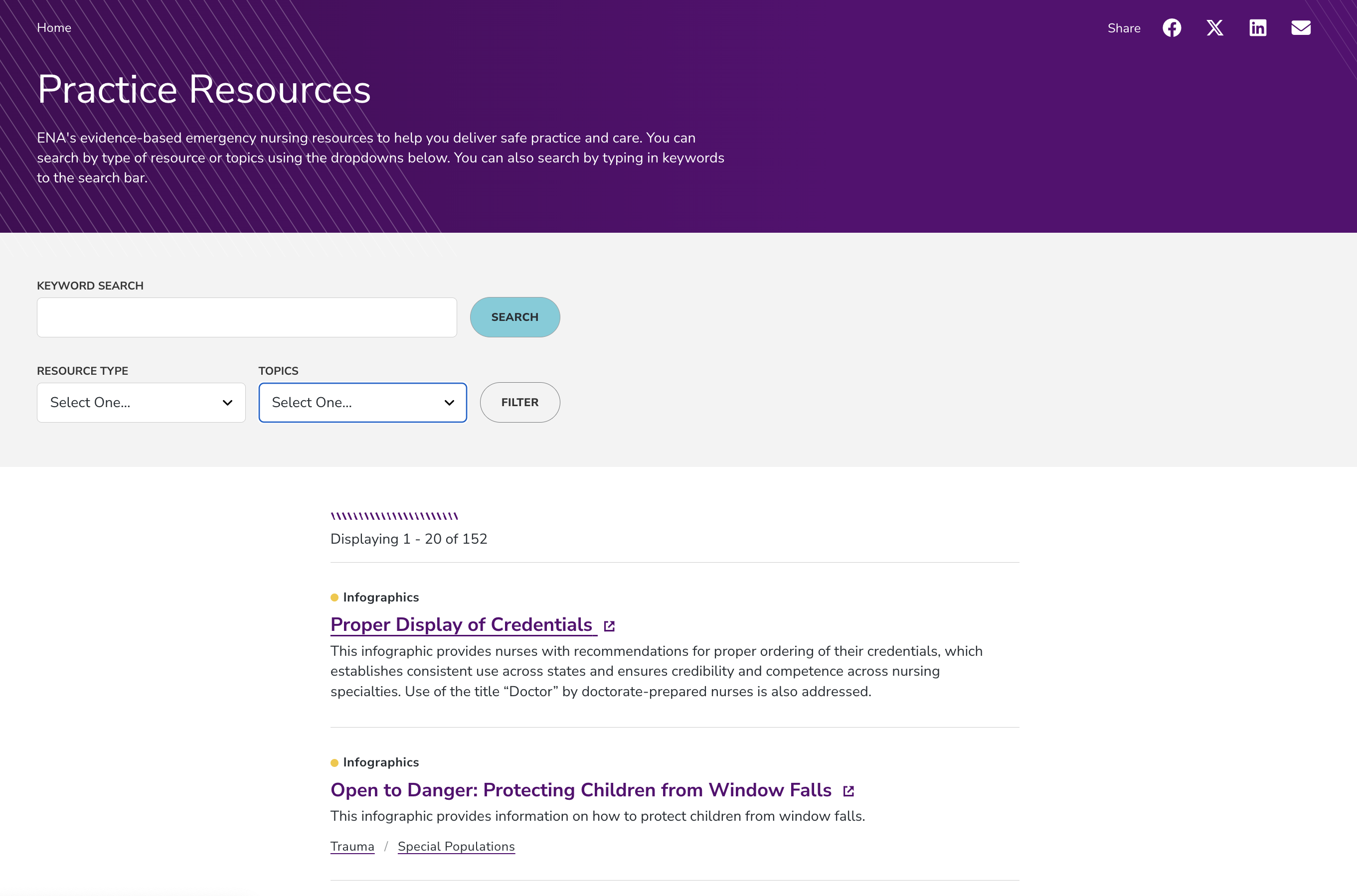
What we liked:
- Quick and easy navigation to access education content in ENA University
- Unique content patterns to help guide users through their education journey, either by informing users what topics are available or specific courses
- Key course content like title, CNE hours, and what is covered are at the top of the course page to help users find the key information they seek, fast
- A robust resource library is available and able to be sorted by content type or topic
Robust Event Examples
Many associations have numerous events throughout the year. They need the event list page to be easy to access and navigate. The calendar view of years past just does not cut it anymore. Users want to filter, sort, and share the information and register as easily as possible. The next three sites all showcase their events in ways that help users engage, no matter the device they use to access the site.
The National Truck Equipment Association (NTEA)
NTEA (ntea.com) represents companies that manufacture, distribute, install, and sell commercial truck equipment. It provides technical resources, industry advocacy, education, and events to support the work truck industry.
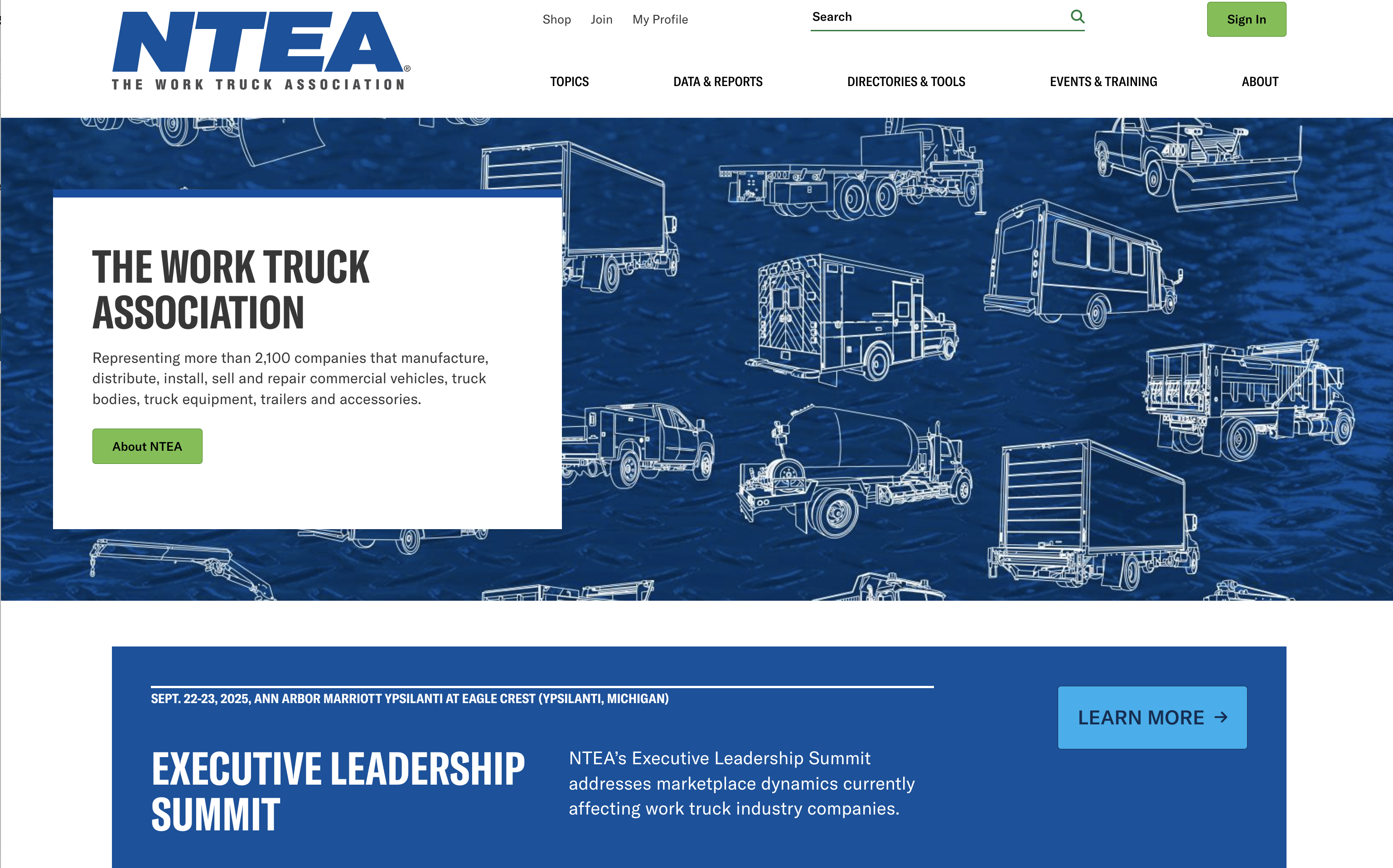
What we liked:
- On the homepage, the hero area and the pattern just below the hero are flexible content areas to promote events
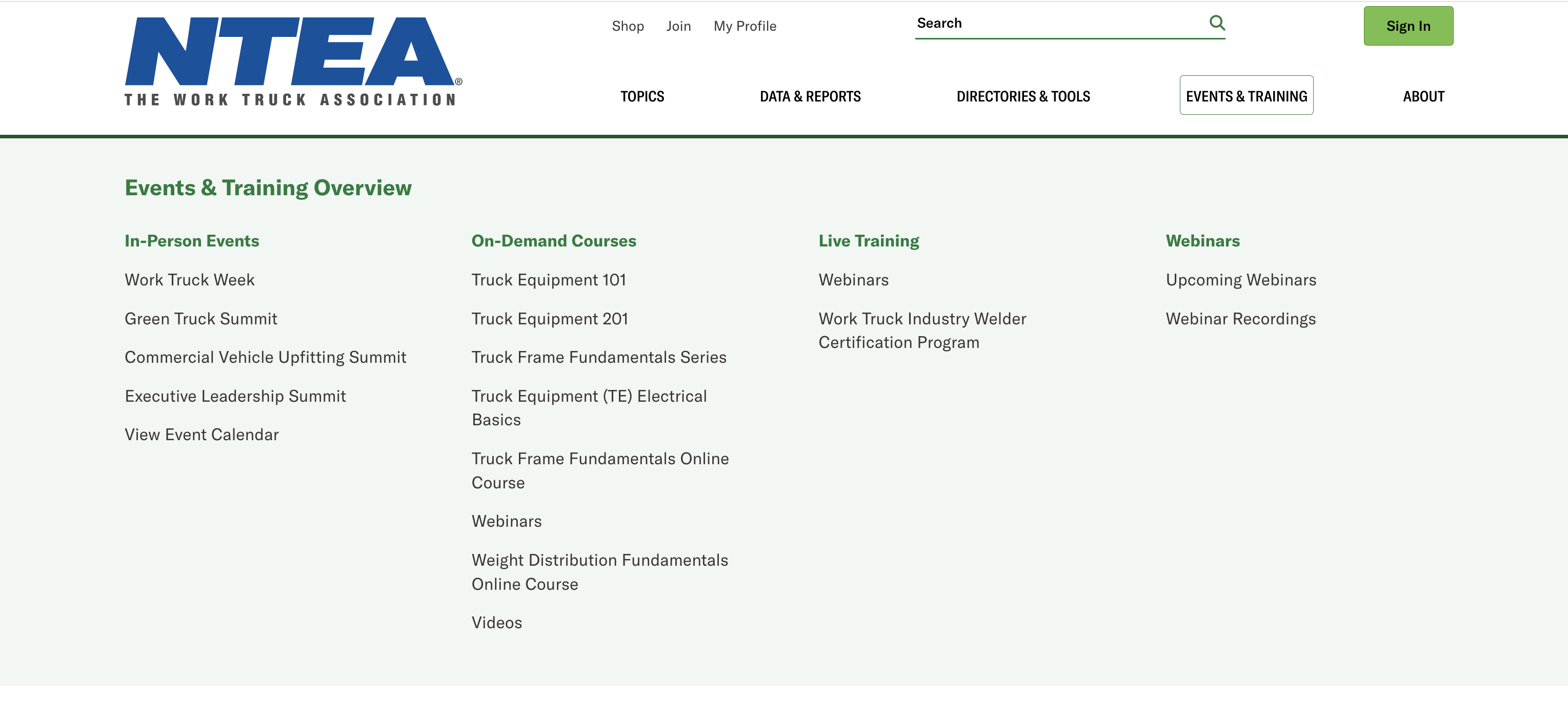
- The events mega menu is organized to clearly identify the types of events
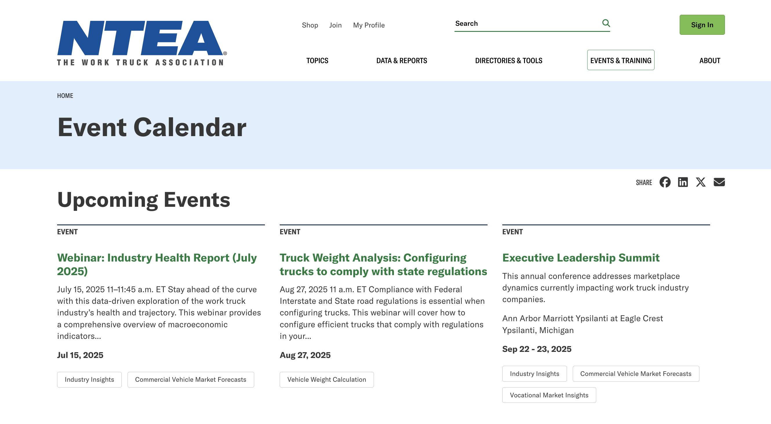
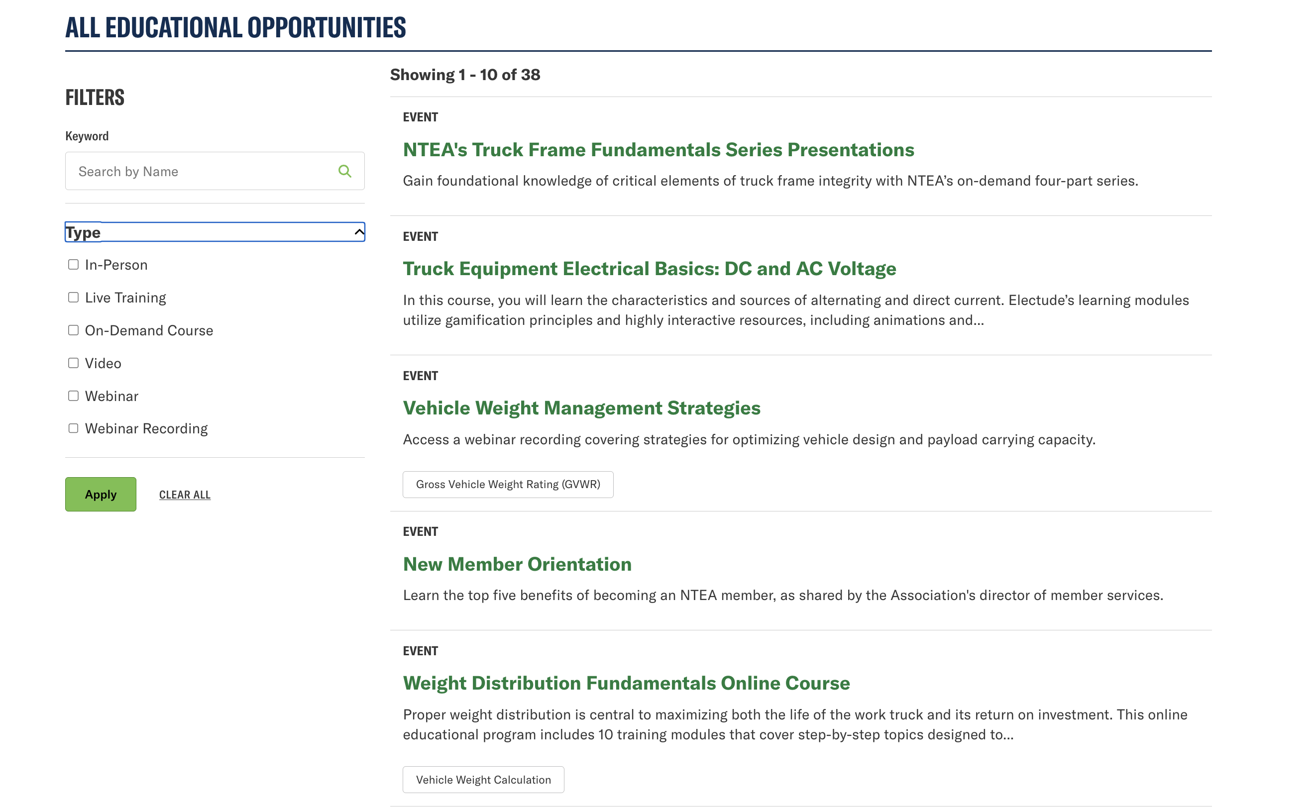
- The event calendar features up to three upcoming events and then a list view where users can filter by type
U.S. Chamber of Commerce
We revisited the Chamber of Commerce for their events page, as there were many good things to share.
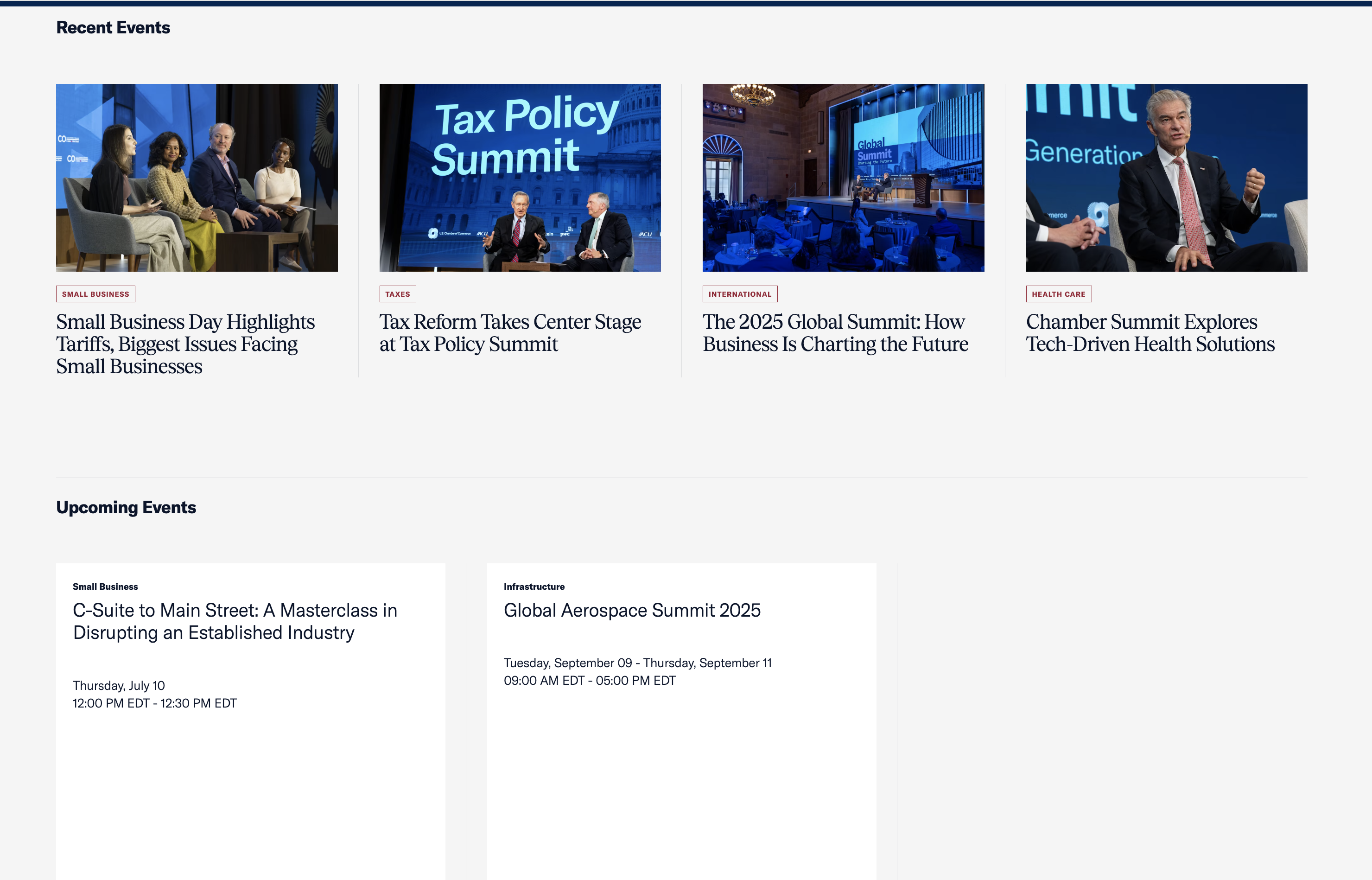
What we liked:
- The experience starts with the mega menu where you can see featured events and access all events quickly and easily
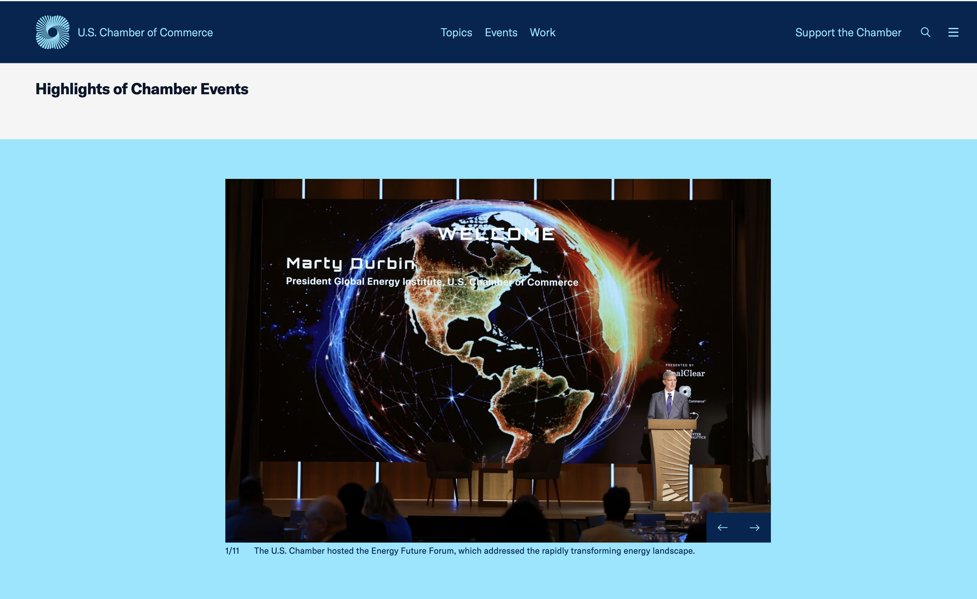
- The events page starts with highlights so users can see what has happened at past events perhaps get a little FOMO which will make them scroll down to see what is coming up next
- We liked the visual treatment of recent events, having images and upcoming events not having images because after all how can you show an event photo and it has not yet happened
American Marketing Association (AMA)
AMA (ama.org) is a leading professional association for marketers, providing resources, training, and community to advance marketing knowledge and practice.
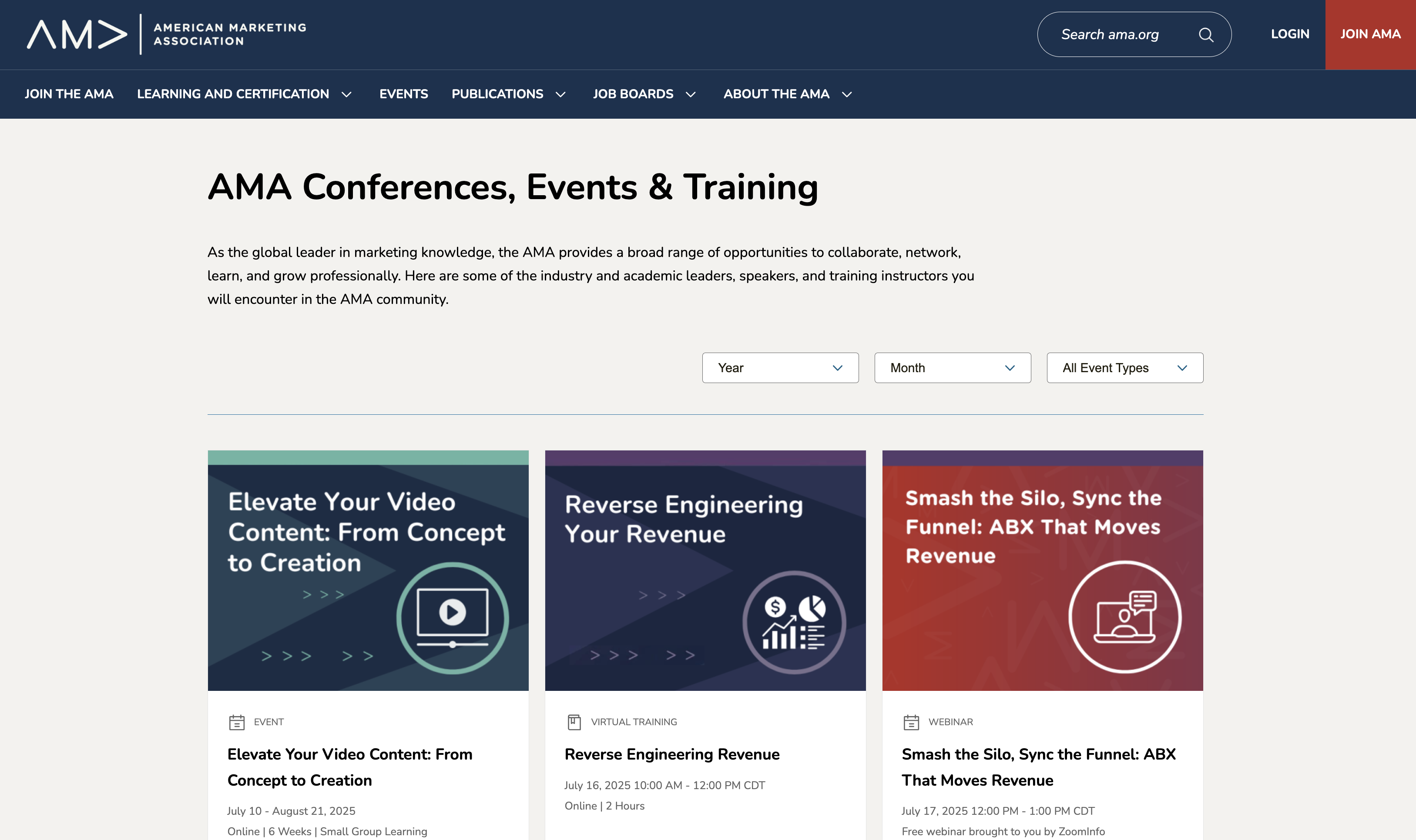
What we liked:
- The navigation takes you directly to the calendar view, which is very simple and clean
- Users can filter by year, month and types to refine the results
- The card design is easy to read while still providing a lot of information, including type, date, duration, etc.
Why This Matters For Your Association Website Redesign
If your association’s site is hard to navigate, off-brand, or lacking in engagement, it’s time to rethink your approach. The associations featured here do more than look good. They solve for usability, discoverability, and clarity. These are three key elements every professional association website should prioritize, which make them some of the best association websites out there.
When planning a redesign for your association site, consider starting with these questions:
- What do our members visit our site to do most often?
- Can they accomplish that task in two or three clicks?
- Does our brand come through in the design, copy, and structure?
Where to Go From Here
If you're looking to improve or redesign your association website, take inspiration from the examples above. And if you’re ready to start your own project, we’d love to help you align your site with your mission and your members’ needs; contact us today.