Empowering the World's Greatest Minds: Using Search and Taxonomy to Power Strategic Website Design
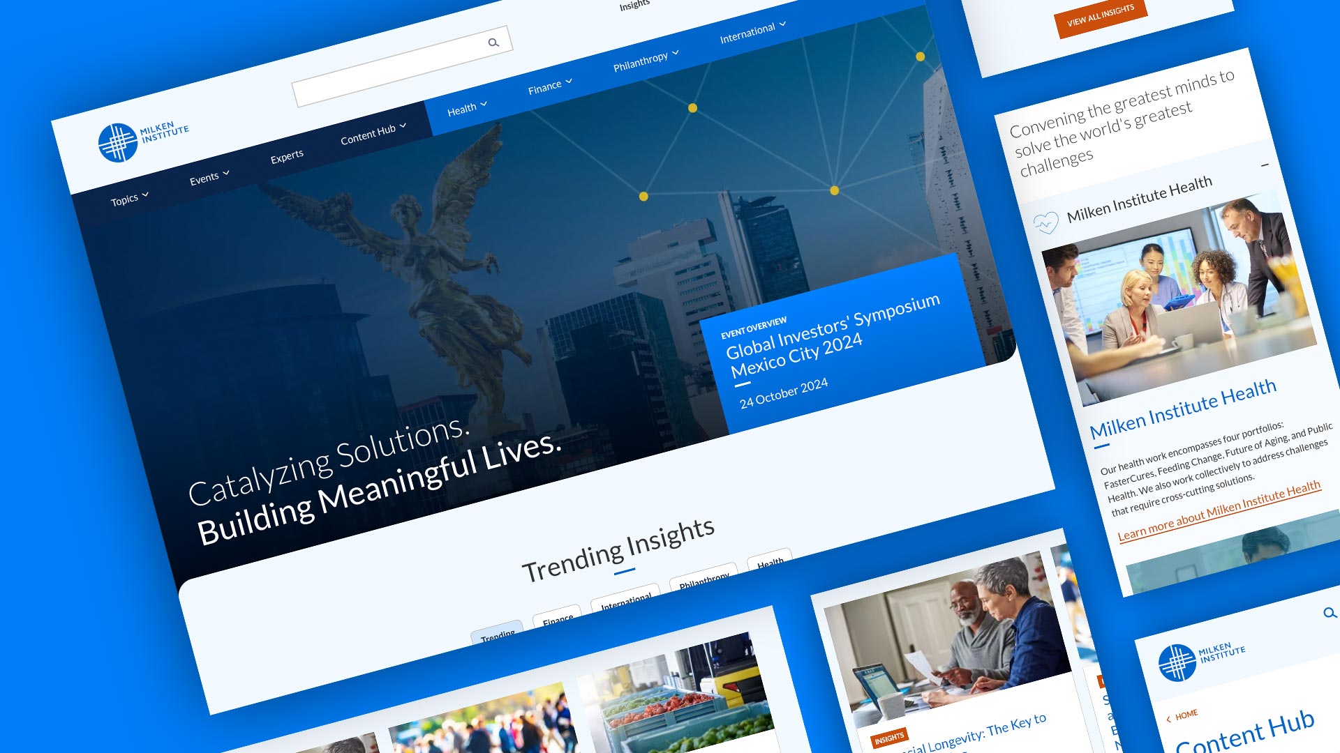
After the successful launch of the interactive online pathways, we continued our work with Milken Institute by engaging in a full strategic website design and transformation. We leaned into research findings from current and past projects to provide a content-driven experience, putting event sessions, thought leadership, and thousands of hours of research right at a user’s fingertips. Here are the five key takeaways from the redesign.
1. Opportunities and Discovery
As we conducted in-depth workshops with stakeholders across several departments, we aligned on the following goals to achieve with the strategic website design:
- Better articulate who they are and what they do
- Improve visitor engagement by serving up related content to match users’ expectations
- Provide stronger conversion opportunities
- Improve site performance and reliability
Next, we heard from users in 1:1 interviews to understand how they interact with content on the website, what met their expectations, what did not, and what might help them engage more deeply with the content. Sandstorm created a rich set of personas to use as our guide for information architecture and user experience strategy.
2. Think Like a User
Three main inputs informed the information architecture phase of the project:
- User behavior and expectations for how to find content on the website
- Competitive analysis of other think tanks, research institutions, conveners, and news outlets
- Business goals of promoting the pillars of the Institute
These led our creative design team to create the bifurcated navigation: on the left, published content organized by topic and type; and on the right, the pillars, research areas, and programs that make up the Institute. This approach addressed a frequent conflict in goals that arose as part of the strategic website design: presenting content the way users expect to find it vs presenting content the way the internal teams think about it.

Once users got to the site, we also needed to keep them engaged by not creating “dead ends”. Whether browsing by topic or coming directly to a particular report or another piece of research from a newsletter, we needed to serve up additional relevant content wherever they landed. Specific display settings allowed us to tailor the related content based on the page type and how broad or narrow the content on that page might be.
3. Remember, Content Editors Are Users Too
When we decided to transform the current Drupal 10 site instead of starting development from scratch as part of the strategic website design, we took the opportunity to audit the content types, taxonomies, and other entities used to publish content to the site. To help streamline the process for content editors and make use of Drupal’s native content editing features, we optimized the editor experience in the following ways:
- Made the content types more intuitive. We let one content type do the heavy lifting for most of the Content Hub, using taxonomy vocabularies to dictate the format of each piece of content.
- Utilized Layout Builder for flexibility. Establishing a default layout for Layout Builder-enabled pages gave content editors a blueprint for keeping content consistent, but allowed them to make other choices for less standard pages.
- Made important fields and files easier to find. The previous site used media entities to create pages for things like reports, and certain metadata was hidden in fields that required four or more clicks to find. We transformed existing content types to surface reports via automated migration and moved important media like featured images into new fields that are easier to access.
4. Let Taxonomy Do the Heavy Lifting
To support our new menu design and the many variations of related content on the site, we needed a solid foundation to make the connections between pieces of content - enter taxonomies!
The previous site used taxonomies, but there were 17 vocabularies, many unused, some not working properly, and some in need of a good cleanup. We took the opportunity to streamline or transform the taxonomies in use and add new ones where necessary to support the vision for the strategic website design. This included:
- Rounding up similar vocabularies
- Consolidating terms and removing duplicates or vague terms
- Nesting terms to create a logical hierarchy and lineage to surface content on related pages and their parent pages
- Leveraging AI to transform topic terms into SEO-rich keywords
The result was a rich infrastructure that allows content editors to choose multiple topics, one content format (report, comment letter, etc), a region where applicable, and the organizational pillar with which the content is associated.
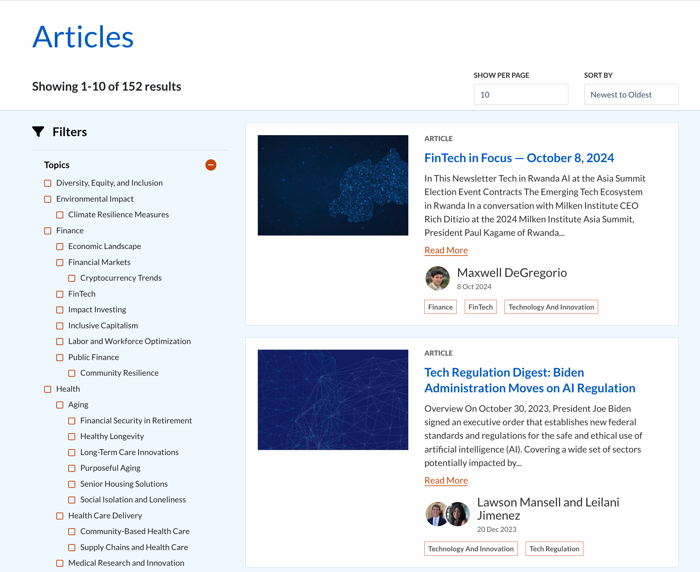
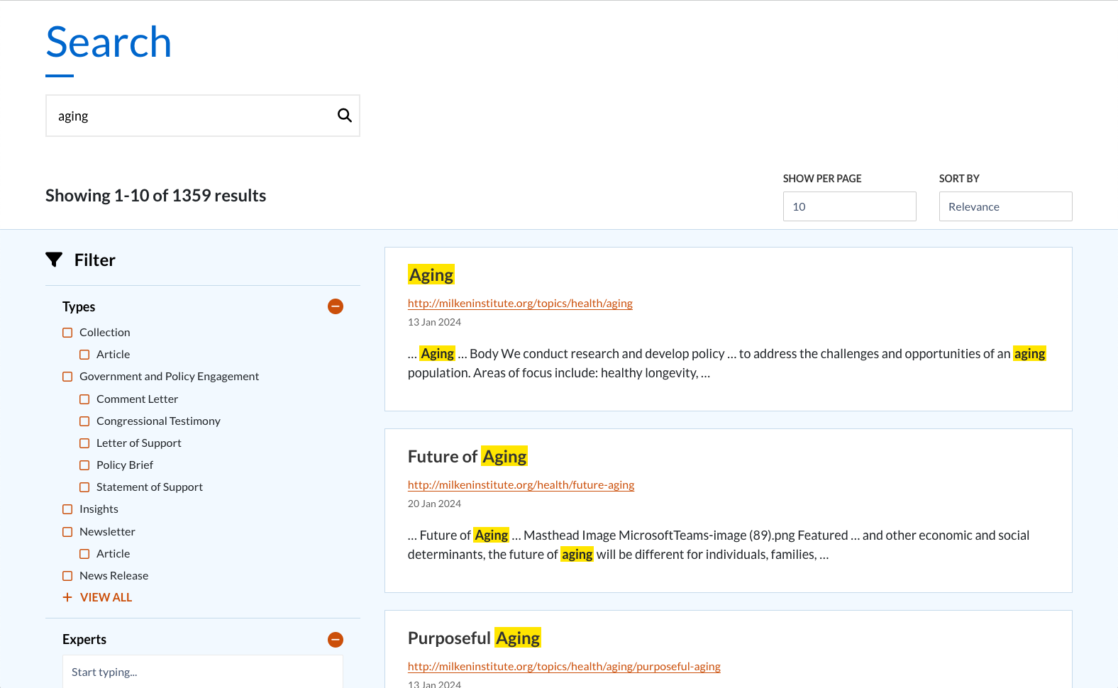
5. Making Search a Success
Even with all the heavy lifting that the taxonomies and related content do on the site, one thing is certain: some users will skip it all and go directly to the search bar. We heard that users (and stakeholders) were disappointed with the performance of search on the previous site, so we went big using Drupal's Search Web Components.
Search Web Components is a robust Drupal module that makes tailoring facets and filters easy for an optimal search experience. It supports our strategic website design by making user interactions easy to follow and understand as the search results are refined. Facets and filtering help guide users with the following features:
- Only the filters that limit the list appear
- List updates instantly when filters are selected
- Filters are hidden and exposed with “Collapse” and “Show More” options as needed
- Autocomplete dropdowns for long lists (experts, events)
- Number of results indicated and user controls for how many to show
- Context-rich results
If you'd like to discuss better leveraging your website content and taxonomies like Milken Institute, let’s schedule some time to see how we can help!