Apple Worldwide Developers Conference Upgrades for Great User Experiences

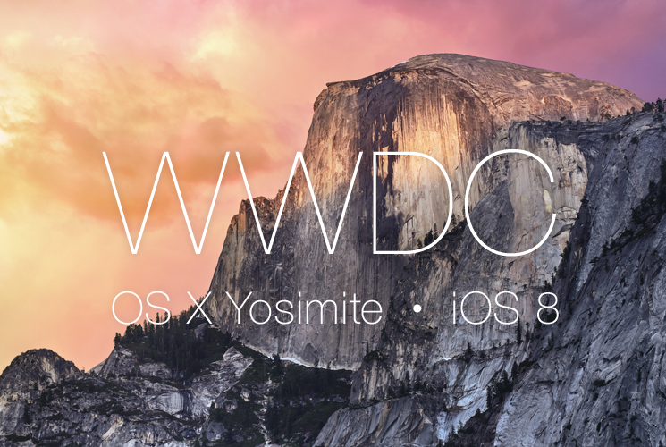
Last week was Apple’s annual Worldwide Developer Conference. They are releasing a lot of new software and updates that I found particularly helpful. From some of the announced developments, it appears that Apple is continuing to make a great user experience through their products. Here are some highlights from the conference that are particularly beneficial to Apple users.
User Interface Design
Smartphones are a big deal, particularly for die-hard iPhone users. Apple realized that as much as people use a desktop operating system, the one that they spend the most time on is on their phone. The new desktop operating system, named Yosemite, will be streamlined to look more like the their mobile design and experience:
- OS fonts will go from the current Lucida Grande to Helvetica Neue
- Toolbars are refined to focused on clarity and utility and they’re adding translucent “materials”
- All icons are being updated (They finally have a great looking Trash Can!)
- The toolbar and dock have a “Dark Mode” option
Continuity
One of the big talking points was: “Use the right device for the moment.” As users are using more tablets and smartphones, specifically iPhones and iPads, their experience going from device to device will be smoother.
- AirDrop - It now works between iOS and the Mac OS
- Handoff - Your devices will be aware of what you're working on. You’ll be able to pick up where you left off on another device.
- Instant Hotspot - If you're using a mac and you aren’t near a WiFi, but your phone is nearby, your computer will recognize it as a hotspot. We will see how seamless this is, there would be some setting up before you can use it automatically.
- Phone calls - When you receive a phone call, your computer presents the caller information in addition to your phone. You can even accept the phone call from your computer, even if your phone is across the room. You can make phone calls from the computer as well.
Interactive Notification
Since users are interacting primarily with their iOS devices, Apple is making advancements to make this experience easier. Users can now:
- Swipe down to interact with notifications:
- Respond to text messages
- Accept calendar invites
- Like or comment on Facebook posts
- Double click the home button to get a list of the people you communicate with the most
Quick Type
The announced upgrades will make typing on iPhones and iPads much easier (and hopefully reduce the number of mistaken autocorrects).
- Keyboard suggestions based on what you type (hello mistaken suggestions)
- Suggested options to reply to a message
- Language based on how you communicate with certain people (for example, you may say the “party was really nice” to your mom or say it was “epic” to a good buddy)
Messages
This might be my favorite addition to the iOS since “Do Not Disturb” in the iOS 7 release. Group messaging is now better than ever. I’m sure everyone has been on a message chain from hell. At the time it might have been useful, but 3 months later a new conversation gets started on an old chain and it blows up your phone. You now have the option to:
- Leave threads
- Turn particular threads to “Do Not Disturb”
- Add and remove people
- Name the thread
You can also sort to see all of the images used in that thread and shared locations. This will be great when you're with a large group message and would like to keep track of that one friend that barely comments.
There is also a new feature to send voice and video messages straight from the Messages App.
Family Sharing
You can now share media with family members if all accounts share the same credit card. This setup keeps your kids from spending $2,500 on in-app add-ons. You can manage settings so that certain family members, such as your 6 year old on the iPad, have to ask you in order to purchase an app. You get the alert on your device to approve or deny their request.
Photos
I’m a designer and love taking pictures. The new Photos advancements are very cool. The new app has smart editing controls, such as levels for light and color.
For example, you can select a photo to edit and click the smart editing controller. You get a smart light editing feature. To achieve this, the app has an algorithm that simultaneously adjusts brightness, contrast, exposure, highlights and shadows at the same time. The same for color.
Also, photo storage is easier with iCloud pricing: the first 5GB are free, 20GB for $0.99 a month, and 200GB for $3.99 per month. They even have tiers up to 1TB (who wants 1TB of selfies?).
Think Different
It’s good seeing Apple continue to innovate, especially when the updates are free to users. The whole conference was centered on upgrades and innovations. They didn’t sell, they only shared what was coming to everyone at no cost. I can’t wait to see what they will unveil next.


