Wireframes 101: How To Build Intuitive, Usable, and Scalable Prototypes
Intuitive navigation is one of the secrets to an easy-to-use website. Our approach is to establish data and information architecture based on personas, usability test results, user research insights, and web usability standards to intuitively organize and connect your audience to the content they need. In order to quickly convey the organization of information, we develop clickable wireframe prototypes to visually demonstrate information priorities, basic layout, and navigational structure.

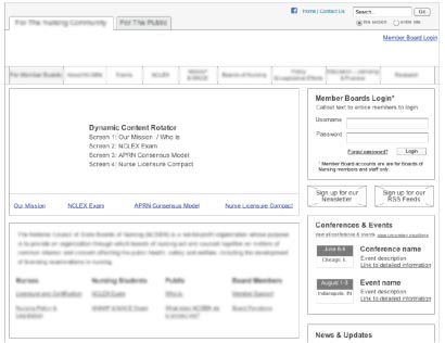
Wireframes are similar to a blueprint for building a house. A wireframe is generally black and white, contains very little graphic design, and identifies the general placement of web site elements and information including your main nav, user interaction points, news section, image area, content area, shopping cart, etc. This forces you to consider the site's functionality, instead of focusing on a graphical treatment.
Information architecture design and wireframe development is part of the responsive web design and web development process reducing your costs and saving time. Making changes to the wireframe is much faster than making creative and development changes.


