User Research and Design Services in Action: Transforming Deloitte Insights' ConsumerSignals Dashboard

SUMMARY
Discover how user research and innovative design can transform a complex data dashboard into an engaging, user-centric experience. Through our ongoing partnership with Deloitte Insights, Sandstorm redefined the ConsumerSignals Dashboard, making it an invaluable tool for global professionals across industries. This blog post delves into our collaborative approach including foundational user research, interactive workshops, high-fidelity prototypes, usability testing, and finalizing the user interface. The results: a 51% increase in traffic and significant improvements in user engagement.
TABLE OF CONTENTS
- Bringing Data to Life Through User Insights
- Designing for the Entire User Journey
- Prototype Development and Testing
- Accessibility and Usability
A Defined User Experience is the Foundation for Success
We partnered with Deloitte Insights to enhance its user experience through in-depth user research and design services. Our work included one-on-one interviews with target audiences, including Fortune 500 C-suite executives, to uncover key insights and identify three distinct personas. These personas guided strategic decision-making for Deloitte Insights, helping to align its offerings with audience needs. Additionally, we developed detailed user flows for each persona, highlighting essential touch points and addressing critical pain points across Deloitte Insights' interactions.
Bringing Data to Life Through User Insights?
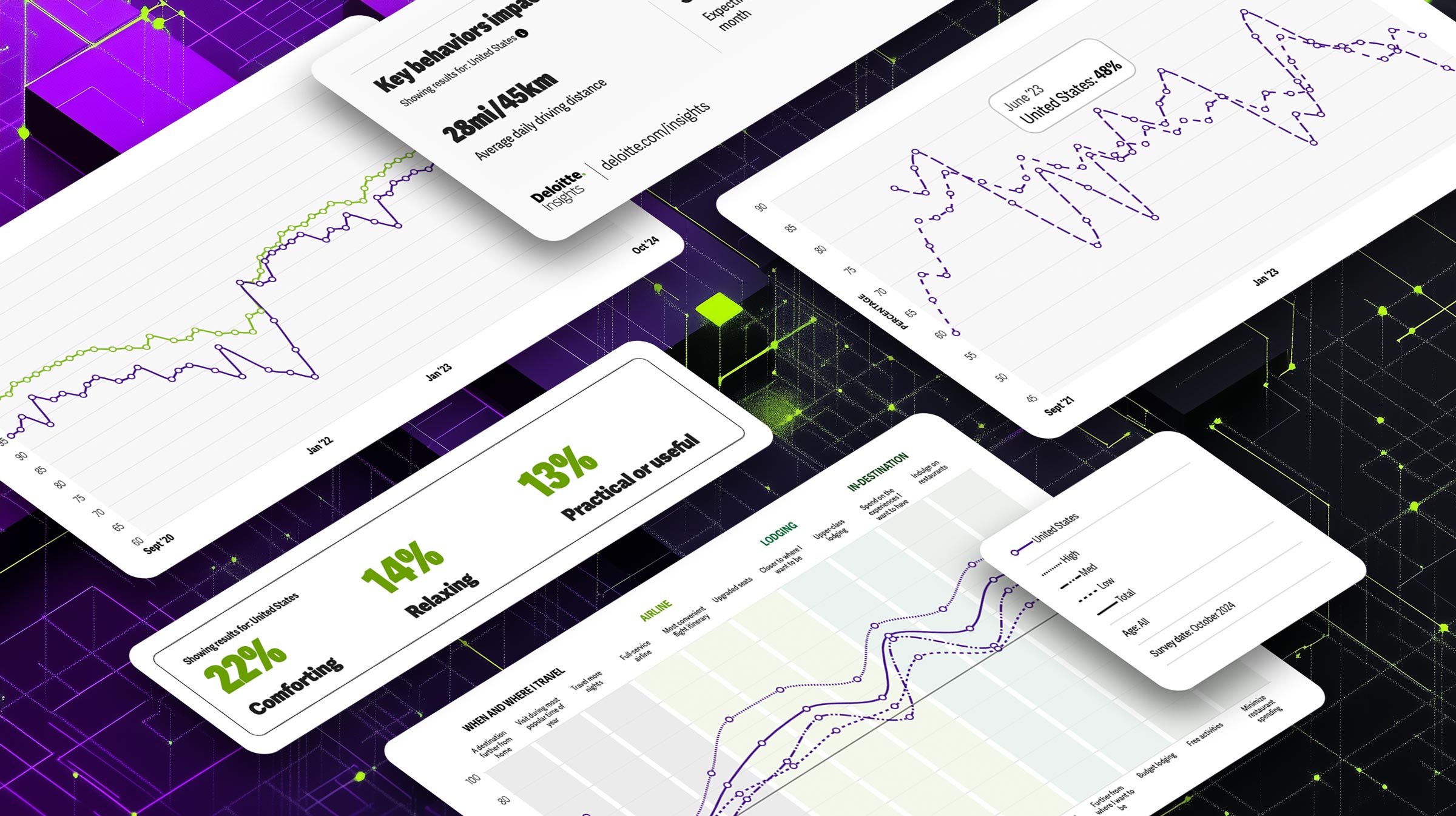
We then went on to redesign the Deloitte Insights ConsumerSignals Dashboard, transforming it into a comprehensive destination for consumer behavior data. The primary goals were to modernize the dashboard, elevate the Deloitte Insights brand, and improve the user experience through accessible interactive data visualizations and a flexible, component-based design.
Our design process began with a series of interactive workshops aimed at aligning with Deloitte Insights’ strategic objectives and gathering comprehensive input from stakeholders. These workshops allowed us to set a strong foundation for the redesign by understanding the dashboard’s goals and mapping out critical content and feature requirements.
Workshop Highlights
- Defining the Vision: Unpacked the existing dashboard and established a clear modernization plan.
- Feature Prioritization: Outlined key content modules, interactions, and data visualization requirements, while also recognizing that the dashboard needs to be flexible for new data sets and charts.
- Stakeholder Engagement: Facilitated collaboration to capture diverse perspectives on what the final product should deliver.
Designing for the Entire User Journey
After the workshops, we developed a series of questions to guide the design and functionality of the dashboard. These questions were informed by the personas and user journeys, allowing us to empathize with users and address their needs throughout the experience:
- Pre-Interaction Steps: What drives users to seek consumer behavior data? What business needs and resources do they rely on before accessing the dashboard?
- During-Interaction Steps: How do users engage with and navigate the dashboard to fulfill their needs? What additional information and features would be helpful?
- Post-Interaction Steps: How do users integrate the data into their workflows? Do they share insights with their teams or use them to inform strategic decisions and reports?
By considering the entire user journey, the dashboard design provided a comprehensive and user-centric experience that resulted in our UX strategy. This allowed the users to stay more engaged with the dashboard as more features and data updates were added.
Prototype Development and Testing: Bringing Research to Life
With our UX strategy in hand, we created a high-fidelity, clickable prototype that included features like:
- Customizable Data Views: Enabled users to filter by industry, region, and time frame for personalized insights.
- Interactive Visuals: Included bold, clear charts with labeled axes and intuitive navigation.
- Personalized Exploration: Implemented a "choose your own adventure" approach that empowered users to navigate data as they wished
To ensure what we had created would resonate with our target audience, we conducted 45-minute, task-based usability studies with participants who matched Deloitte Insights’ key personas. This step was essential in validating our prototype and uncovering areas of improvement.
Refining the User Interface for Accessibility and Usability
Using insights from usability research, we made targeted improvements to the UI to ensure an intuitive and seamless experience. For example, one key enhancement included creating an introductory guide to clearly explain the tool’s purpose and provide usage instructions. We also refined the in-page navigation by reorganizing and labeling content modules for easier access and comprehension.
Next, based on how the users used the prototype and wanted to interact with the data, we needed to create a visual language to present the data in any scenario so it was quickly understood. It was crucial to develop a design system that was accessible, flexible, and easily manipulated and understood by our global users.
Beginning With Color
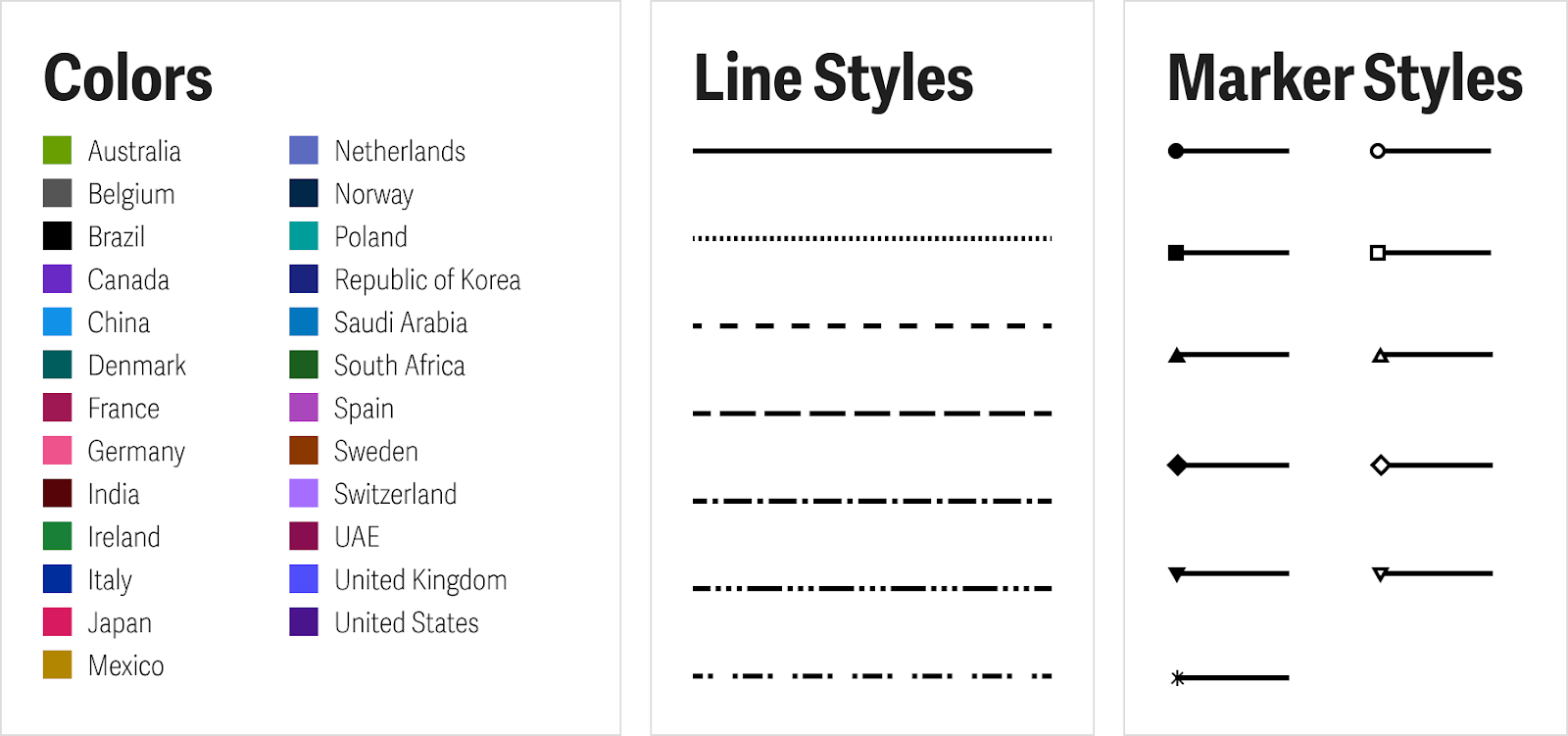
Our team created a color palette to accommodate the 25 countries represented in the charts. Each color was tested to ensure it maintained a 3:1 contrast ratio required for WCAG 2.1 compliance for graphics and user interface components against a white background. However, we discovered that achieving this level of contrast while keeping the data legible and visually distinct was not feasible.

To address this, we moved beyond color by introducing additional visual elements. Seven distinct line styles with varying dash patterns were created, along with ten marker styles—including circles, squares, triangles, diamonds, and stars, in both solid and outlined versions. These elements worked together to differentiate the data visualizations and clearly identify the data while preserving accessibility and readability.
Telling a Story
Another focus was on designing data to tell a story. Each chart was created to convey key insights, supported by relevant statistics and takeaways. Users could filter the data to focus on the information they sought and export customized views for use in reports, case studies, and presentations. The result was content that was scannable, interactive, and engaging.
Ensuring Success
Working closely with the internal Deloitte Insights team made the project succeed. Our clients were exceptional collaborators throughout the project. Their active involvement in co-creating the design system and their expertise in developing the dashboard were instrumental to the project’s success.
Results and Impact
Our thorough approach—combining workshops with existing user research, prototype development, and usability testing—led to substantial improvements:
- 51% Year-Over-Year Traffic Increase: Reflecting the success of our user-centric redesign.
- Bounce Rate Reduction: A 22%-point decrease, showcasing improved engagement.
- 170% Increase in File Downloads: Users found valuable content easier to locate and access.
- 8X Increase in Scroll Completion Rate: Highlighting deeper user interaction with the content.
- 54% Return Visits: Demonstrating ease of use and quality of content.
And users of the dashboard say:
“We’re heavy users of ConsumerSignals, our industry team leader strongly believes that this data is extremely useful to give an edge to discussions with CXOs (they are helpful in opening meetings, creating context, and show our knowledge of the consumer market).
- Current Global User
“If you really dive deeper into this [data], it's really quite cool!”
– Current users, Global Grocery Leader

And the icing on the cake? It’s also award-winning, having received the 2024 Gold MarCom Award as well as Shortlist Finalist in the Communication Arts Interactive Competition.
The successful transformation of the ConsumerSignals Dashboard demonstrates the critical role of combining user research and design services. By taking the time to understand user needs and iteratively refine the experience, together with Deloitte Insights, we created a dashboard that resonates with diverse audiences and drives business results.
Visit the ConsumerSignals Dashboard to our work in action.
Ready to transform your digital platform? Reach out today to learn how our user research and design services can elevate your user experience and boost engagement.


