UNICEF USA’s Drupal Migration -
3 Implementation Strategies You Can Apply to Your Migration
UNICEF USA is a national non-profit organization that works to advance the global mission of UNICEF by rallying the American public to support the world's most vulnerable children. With a new brand vision, messaging, and content that needed to reflect the updated experience, UNICEF USA partnered with Sandstorm to build a new digital experience in Drupal via www.unicefusa.org that better conveys the organization's impact worldwide, while driving donations to improve the lives of children.

UNICEF USA identified the need to optimize the website’s user experience through A/B tested designs, standardized page layouts, and improved navigation structure to help potential donors on their journey through the site. The prior Drupal 7 site no longer served the editors' workflow needs, making content entry and organization confusing and cumbersome. The organization also faced challenges with outdated technologies, poor site performance, and inflexible design elements.
Sandstorm worked with UNICEF USA to identify technical requirements and the most efficient ways to implement the new brand vision in Drupal 9. The team consulted on the new information architecture to create a navigation that would be more intuitive for users. Sandstorm also collaborated with content editors to reduce bloat in the administrative experience and streamline how content is published and cross-referenced on the site.
From this successful rebuild, we’ve identified 3 Implementation Strategies that can be applied to your Drupal 7 to 9/10 upgrade:
Implementation Strategy #1 - Use of Layout Builder for Better Consistency & Flexibility
The Challenge
UNICEF USA’s custom design requirements created a lack of consistency in design and overall user experience.
The Solution
Create content types that use Drupal’s Layout Builder blocks with a finite set of brand-specific customizations, which helped to enforce the site’s global styles and allow flexibility for unique content requirements.
UNICEF USA has a sprawling landscape of programs, fundraisers, events, and other efforts to support their mission. As programs have grown, so have the campaigns to market them, creating offshoot branding, assets, and design standards. In Drupal 7, workarounds for the lack of flexibility created a spiderweb of pages that had no connection back to the main UNICEF USA site.
The team made the strategic decision to use Drupal’s Layout Builder in order to:
- Address the prior site’s inflexibility and lack of granular control.
- Provide editors the flexibility they needed for various campaigns, requests, and outreach efforts.
- Reduce the need for custom design and development that strayed from the larger UNICEF USA brand
We recognize that Layout Builder isn’t the exact match for every use case, but for UNICEF USA it was ideal since their teams were already familiar with Drupal and went through in-depth training on how to maximize its use within the new site, without introducing new UX/UI issues inadvertently.
Layout Builder also struck the balance between the team’s desire to create more bespoke pages for specific events, campaigns, or engagements, and the organizational goal of maintaining a consistently-branded user interface with the UNICEF USA header and navigation.
Implementation Strategy #2 - Agile Scrum Methodology for Delivering Maximum Value
The Challenge
In order to deliver on UNICEF USA’s launch date, our teams needed to begin development in parallel, before the UI design phase was fully completed.
The Solution
Develop shippable increments after UI designs were tested and final design concepts were approved, so the UNICEF USA team could review with their stakeholder teams before beginning content migration.
Sandstorm’s process utilizes an Agile development methodology, using the Scrum framework, which defines clear implementation roles, and prioritizes what stakeholders need the most, with the ability to adhere to a defined timeline with productive, incremental sprints.
The Agile development methodology was best suited to allow Sandstorm to follow the lead of UNICEF USA’s design partner, who was testing design options throughout the project. Once a test had been completed and the results indicated the preferred design by users, we were able to define the requirements with the UNICEF USA’s project team and move those features into the next sprint.
This allowed our developers to work iteratively on design elements while recommending the most efficient and effective build from a content management and accessibility perspective.
This approach also helped UNICEF USA to:
- Focus on the development efforts of the most critical features to move into Drupal 9 in preparation for launch.
- Continue to manage and groom the backlog (defining requirements, user needs, tasks, etc.)
- Collaborate and work against those items for future phase planning while providing a launchable MVP solution in the timeframe UNICEF USA needed.
Implementation Strategy #3 - Iterative Content Migration to Maximize SEO Value and Donation Impact
The Challenge
UNICEF USA had several years' worth of content (and thousands of nodes) that needed to be mapped and migrated to the new Drupal solution.
The Solution
Perform a thorough content audit and develop an agile-based content migration plan. Incrementally release new content types within each sprint.
Planning for a combination of automated and manual content migration allowed the teams to identify the key fields and content areas that were essential in reaching the organization’s goal of communicating UNICEF USA’s efficacy around the world.
Sandstorm worked with the UNICEF USA team to identify unnecessary fields, taxonomies, or workarounds that made the existing content management workflow inefficient and through those decisions, worked to migrate or transform the content for its new home in Drupal 9. This allowed the teams to prioritize migrating content with the greatest SEO value and donation impact.
This in-depth audit and requirements definition helped the teams accomplish:
- More structured and relevant categorization
- Reducing bloat of extraneous/duplicate taxonomy terms
- Allow for more relevant related content for site visitors
Results & Outcomes
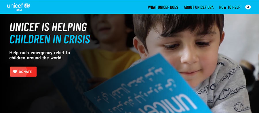
With Sandstorm's help, UNICEF USA was able to launch a new digital experience that is fully responsive, ADA accessible, user-friendly, visually stunning, and aligned with the organization's brand vision. The website is responsible for raising over $35 million per year, so our team ensured the site was optimized for performance, resulting in much faster page load times, improved search engine rankings, and overall better user engagement.

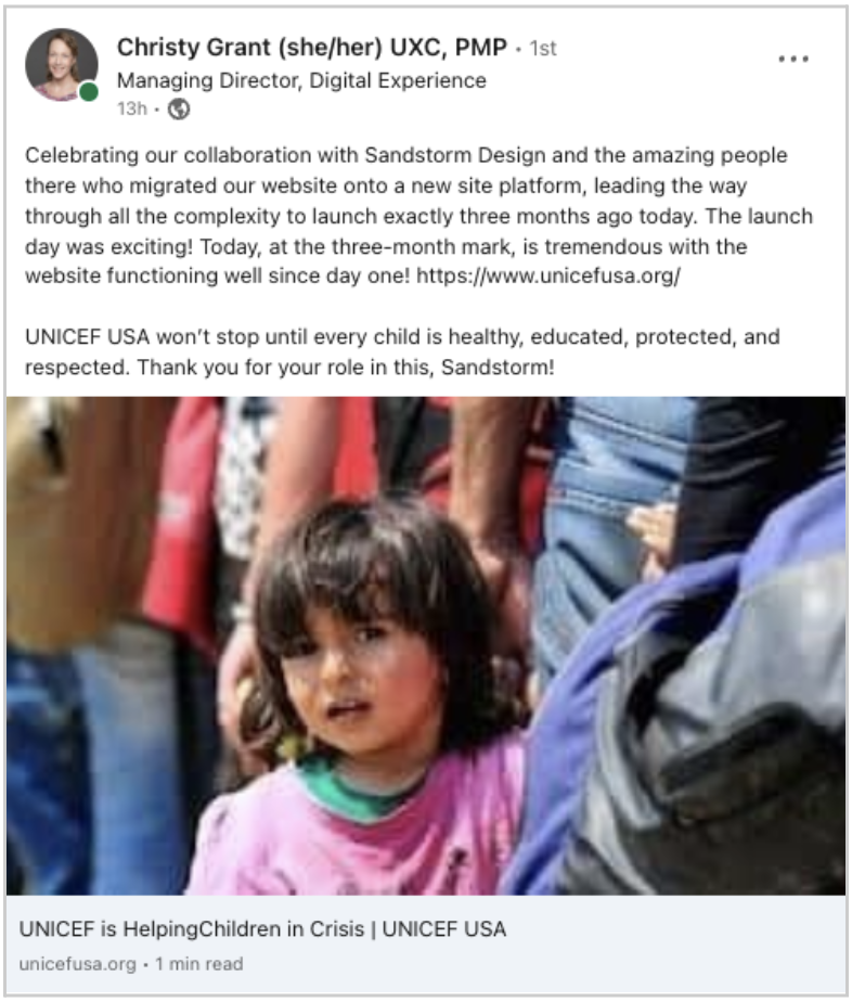
“Celebrating our collaboration with Sandstorm Design and the amazing people there who migrated our website onto a new site platform, leading the way…. The launch day was exciting!”
Christy Grant, Managing Director, Digital Experience, UNICEF USA
Sandstorm's efforts led to a streamlined workflow for content editors, who now have more flexibility to create and publish content while maintaining the integrity of the brand. The new website has received incredibly positive feedback from users, and the organization has seen an increase in donations since the launch, which was an important KPI for success.
Sandstorm's partnership with UNICEF USA continues as we’ve begun post-launch sprints to deliver additional functionality, including improved form submission experiences, additional brand elements, and further refining the content editor experience.


