How to Make Websites Accessible, Part 2: Development and Content

In Part 1 of our Accessibility series, we provided an iterative process framework for managing the ongoing accessibility of your site, including key strategies for how to make websites accessible. To recap, start with an accessibility audit to identify and prioritize the most critical (and impactful) updates.
In Part 2 of this series, we dig into the next two phases of creating an inclusive and accessible website: Development and Content.
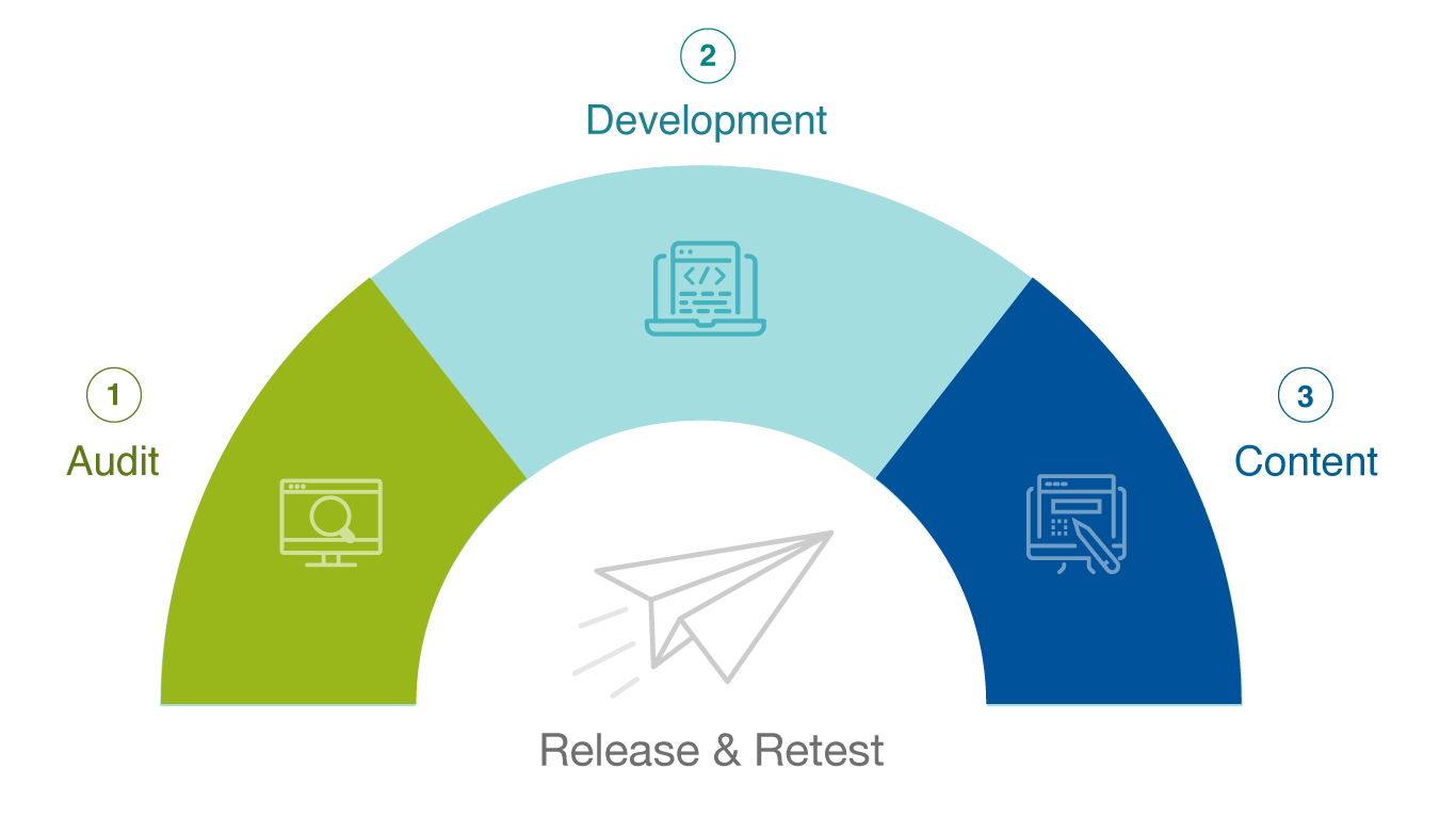
Step 2: Making Development and Design Improvements for Accessibility
Since the audit has been completed, improvements have been identified and prioritized, and the remediation plan has been defined, we want to remind you that accessibility is an agile and iterative process. Breaking the remediation plan into groupings or sprints defined by a set amount of time (e.g. two weeks) is important for success. This way, updates can be grouped easily, assigned to the right person(s), and tracked to completion. Once completed, those updates can be pushed live, and the process starts again with another two-week sprint.
Trying to tackle all the updates in one big push is not the best approach since it can be overwhelming and may cause mistakes, additional issues, or rework.
Now, let’s dive into development and design improvements.
Instead of being hypothetical, we want to provide real examples of development and design updates we make for our clients. As you can imagine, we’ve worked with dozens of websites to help improve their UX and web accessibility (it’s kind of our thing), so we’ve compiled a list of three common issues and their fixes. These issues are seen across all types of sites no matter if they are an e-commerce, association, higher education, or global nonprofit website.
Here are the three most common development and design fixes that we see in websites:
Common Fix #1: Appropriate Markup on Third-Party Forms
User interaction with web forms is fundamental to many marketing and business objectives, such as encouraging a user to download a resource, sign up for a newsletter, or get in touch with your organization via contact form. Being a priority, web forms must be accessible to all users, including those who utilize assistive technologies like screen readers or alternative keyboards. Ensuring web form accessibility usually requires optimization of two core aspects: the form field labels, and form validation.
Most validation issues (like unencoded ampersands, for example) don’t have serious implications when it comes to accessibility. However, some ID validation errors are very important in that they may cause issues relating to how assistive technology interacts with the page and renders the page to the end user.
One serious validation issue that we see on many sites occurs with form markup, especially third-party forms such as Smartsheet Forms. These forms use active IDs for validation errors that can break the accessibility of labels for focusable elements, forms, table header cells, etc.
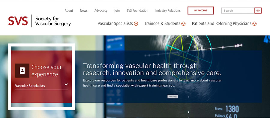
For example, in the case of the Society for Vascular Surgery, the “Go” button of the search field at the top of the page was flagged as having incorrect markup. Although seemingly small, this could have had a profound impact on user experience.
To fix this problem, a developer needs to change the duplicate ID value to ensure each ID is unique. The reason this is important is that unique ID values differentiate each focusable element and prevent invalid markup. (By the way, a focusable element is any item on the website that a keyboard user can navigate to and engage with.)
In essence, it means anyone using a screen reader or alternative keyboard knows exactly where they are on the page as they tab through the form elements. Without this, the user wouldn’t be able to navigate through page and form elements using assistive technology, which means that the web page is out of ADA compliance.
This does not mean you can’t use third-party forms on your site. Instead, simply make sure the developer knows to review the markup to eliminate any accessibility issues before they arise. Additionally, some third-party forms allow for custom coding, which gives developers and organizations flexibility when it comes to meeting web form accessibility standards.
Common Fix #2: Proper Title Attributes for <frame> and <iframe> elements
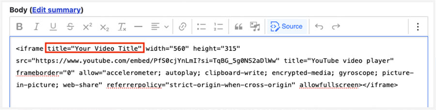
Another third-party issue we see is missing title attributes in iFrames. In most instances, screen reader users find the content in the title attribute redundant or unnecessary. However, embedded YouTube videos must have a title for assistive technologies to accurately read and identify the content to the user.
This is particularly an issue with YouTube embedded within WYSIWYG fields since adding a title is a manual process. Without a title attribute, screen readers will state it’s an ‘iFrame’ without any other contextual information, which is not helpful to the user.
Adding a title in a WYSIWYG field is as simple as adding a title="TITLE" attribute to the HTML of the content:
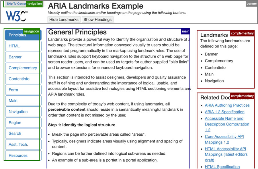
Common Fix #3: Ensure Proper ARIA Landmark Configuration
Similar to Common Fix #1, ARIA landmarks are a technical way to label the organization and structure of a web page by identifying “sections” of a page. This is done through the use of inline HTML markup; for example, <div id=”mainConent” role=”main”>…</div>, where “main” defines the “region” of the page.
These landmark roles provide support for users who navigate your website using a keyboard, allowing them to skip around to the content that is most important to them. According to W3, ARIA landmarks can be used to define the following regions:
- banner
- complementary
- contentinfo
- form
- main
- navigation
You can see in the below screenshot from W3.org how the various sections of the page are clearly labeled. These labels are the landmarks of this page.
Common issues around landmarks include ensuring there are no duplicate landmarks and confirming landmark roles are properly configured in the first place. For example, on vascular.org, the landmark label denoting the “header” area of the page was used repeatedly, and this error appeared across a variety of pages. This meant that users with assistive technologies had multiple landmarks with the same “header" label. This duplication made the page structure unclear and difficult to navigate.
The good news is that even if many pages are flagged as having landmark-related issues, resolving the issue on one page tends to resolve it on all of the others, which makes this a relatively quick, easy, and impactful accessibility fix.
For instance, although we saw the same duplicate “header” error across vascular.org, once our developers removed the repeated landmarks, either by renaming duplicates or consolidating landmarks where it made sense, resolved the problem across nine pages – we love efficiency!
BONUS: 5 More Common Fixes
Everyone loves a little something extra, we call it a good twofer.
5 MORE common accessibility fixes to remember:
- Add labels to form fields programmatically so they can be read by screen readers
- Provide options for users to reduce motion on the website with a toggle or pause button
- Turn off autoplay on videos as autoplay can negatively impact users with sensory sensitivities or cognitive impairments
- Update link behavior to open in the same window instead of a new tab, as those who use a screen reader to navigate will likely not realize that a new window or tab has opened
- Provide alternative color combinations that have sufficient color contrast
Step 3: Content and Retesting
With the foundational discovery steps and initial stages of technical optimization in progress, we can now move on to the last steps of our process for making websites more accessible: content updates and consistent retesting.
Content Can Be the Cause of Many Accessibility Issues
Often, accessibility violations can occur within your content, such as heading hierarchy issues or missing alt text. Since we all know that “Content is King,” it’s important that your website’s content be consumable by everyone who visits your site; this isn’t just ethical, it’s business-savvy, too.
Through ongoing work with clients, we talk a lot about content and how to make it more accessible. Through the audits, we not only identify development and design issues, we also find content that needs to be updated or reworked. Here are some frequent violations that seem to crop up in our audits:
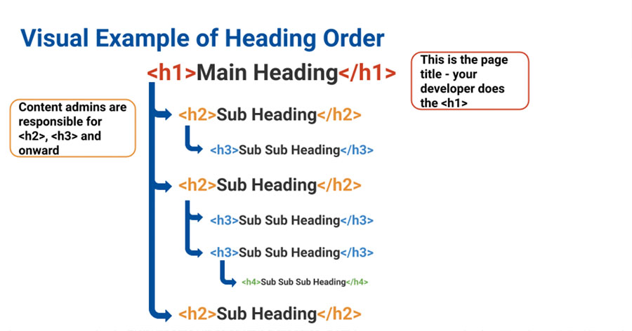
- Structure of Headings: Headings (e.g. H1, H2, H3, and so on) need to follow logical reading order. In other words, you can’t have an H3 without an H2. In that same vein, you and your team should never use heading markup for styling purposes, as screen readers search for these headings to help users navigate the page.
A bonus benefit to proper headings structure is that it can even assist you with SEO, as search engines often refer to page headings as strong indicators of what the page is about.
- Meaningful Link Text: “Click here” does not tell a user where they’re going to go when they click that link. Screen readers and other assistive technologies can be programmed to read off links, which means users have no indication of where they will go when they click “Click here”. Instead, we recommend choosing descriptive link text for your body copy links or CTA buttons; for instance, “Learn more about our custom web development services” (heh, see what we did there?) Also, this is another double-bonus where descriptive link text can be very beneficial for SEO.
- Alternative (Alt) Text: Although image alt text is often used for SEO purposes, its true intended purpose has always been to help visually impaired users experience the web. Well-written alt text should be short but descriptive and should accurately describe the image(s) on the page. This HTML markup helps the user understand what the image is trying to convey if they cannot view the image, or if the image doesn’t load.
We also recommend using “null” alt text (written as alt=” ”) for stock photography and other decorative imagery (such as icons or background images). These types of graphic elements are great for branding. From an accessibility point of view, they are purely decorative and do not provide additional information to support or explain the content on the page thus they can be ignored by screen readers. Using this technique for alt text creates a more seamless experience for the user as they navigate the site with assistive technology. - Effective Use of Color: For the most part, the colors on your website are likely dictated by the front-end styles set up by your creative and development teams. However, there may be times when your team is responsible for uploading background images, or perhaps you inherited a site where color contrast is not up to snuff. Regardless, it’s important to effectively convey information with color, as well as ensure images and text have enough color contrast to meet WCAG guidelines. You can test your website’s color contrast through accessibility tools like webAIM, or work with an accessibility team to conduct a more comprehensive accessibility audit.
How Content Accessibility Training Can Help
Because we are so passionate about creating a more inclusive and accessible web, we’ve developed a hands-on accessibility training curriculum for many of our clients.
This training is focused on addressing violations through content updates, allowing content editors to ask questions, do hands-on training activities to practice the necessary skills, and provide reference materials to guide them as new content is created in the future.
Whether your team simply needs a refresher or if content accessibility is new to everyone, a training session can be a huge boon to maintaining high accessibility scores. It can teach or remind your team just what they need to do to the content on your website so that heavy accessibility fixes are not required in future scans.
When we conduct training sessions around these and other areas, we take care to work within your website and with your actual content. It allows us to be teaching and doing with real-life examples that make sense to your content admins.
This hands-on approach allows us to get through a good portion of accessibility issues and leave your teams with direct experience on how to fix common accessibility issues, along with detailed documentation.
If you’d like to learn more about accessibility training for your team, please give us a shout; we’d be happy to provide more information and see if it’s right for your organization!
Retest Often to Monitor Progress
To address the very human nature of website content management and accessibility, our recommendation is to work with organizations iteratively and perform quarterly or at minimum semiannual scans, analysis, and reporting. Since the report provides both the type of violation and the individual instances of it throughout the website, comparisons between the current and previous reports are useful in monitoring improvements.
In Society for Vascular Surgery’s case, once the first sprint of accessibility remediation was completed, we then conducted another accessibility scan to confirm all the accessibility tasks and fixes were successfully implemented and in compliance before moving on to the next sprints of remaining items.
This process allows us to track progress, uncover any new training opportunities that would be beneficial, and ensure the site remains accessible to users as the site matures and changes.
Remember, Accessibility Is a Journey
More than anything, it’s important that you tackle accessibility with the right mindset. Getting into a pattern of continuous learning and improvement allows organizations to move from the mindset of accessibility as a large initiative requiring a lot of work to one where it’s a consistent, ongoing consideration of the organization with a website that reflects it.
As we always tell our clients, creating an accessible website is not a “one-and-done” project to check off the list. As WCAG guidelines evolve or as you inevitably update and enhance your website, you’ll need to adjust your standards, goals, and practices. Regular audits, reviews, and remediation should become a part of your ongoing website maintenance to help make a more inclusive Internet for all.
Next Steps
If you’re interested in accessibility testing or content training, let’s talk!
Did you miss the first post in this series? Read Part 1: Audit, Usability, and Prioritization.