How to Create Custom Reports in Looker Studio, Part 2: Visualizations

SUMMARY
There are many ways to visualize data in Looker Studio. It all depends on your goals and KPIs, as well the story you’re trying to tell. Here are some of our favorite visualizations and what we use them for:
- Tables: Adding drill-down dimensions and additional metrics to make tables more robust.
- Scorecard: Highlight key KPIs or metrics without additional context.
- Time Series Chart: Highlight wins, losses, or discrepancies in data to display a period of time.
- Pie Chart: Showcase specific demographics or things that may benefit from proportions, such as traffic sources.
- Gauge With Ranges: Plot metric totals on a user-determined scale, e.g. how close you are to hitting a revenue target.
Welcome back to our ongoing series on how to create custom reports in Looker Studio! This part covers more intermediate topics. If you need a rundown of the basics or just a quick refresher on Looker Studio, you can read Part 1 here.
Previously, we showed how to use your existing GA4 data in Looker Studio, as well as how to configure a basic Table visualization with different dimensions, metrics, and filters. This simple table is a straightforward way to visualize your GA4 data, but Looker Studio offers many different visualizations that can be used to tell a cohesive story about your traffic more clearly.
As of writing, Looker Studio has 43 (!) different visualizations available out of the box. All have their unique use cases, but we’ll walk through some of the visualizations we use most with our data analytics clients, how to configure them, and when it makes the most sense to use them.
How to Add Other Visualizations
There are two ways to access the library of data visualizations available in Looker Studio:
1. Update an Existing Chart
If you would like to use a different visualization for an existing chart, first click on the chart you would like to update. The chart will be highlighted to indicate that it is selected.
The configuration menu will open on the right-hand side of the report when a chart is selected. To browse different visualizations, click on the dropdown arrow next to the “Chart” header.

This will open up a quick-select menu where you can choose from the different visualizations available. You can preview the name of the visualization by hovering over its associated icon. Once you’ve found one that sounds useful, simply click on it to apply the visualization. After a few seconds, your chart will update with a new look!
2. Add a New Chart
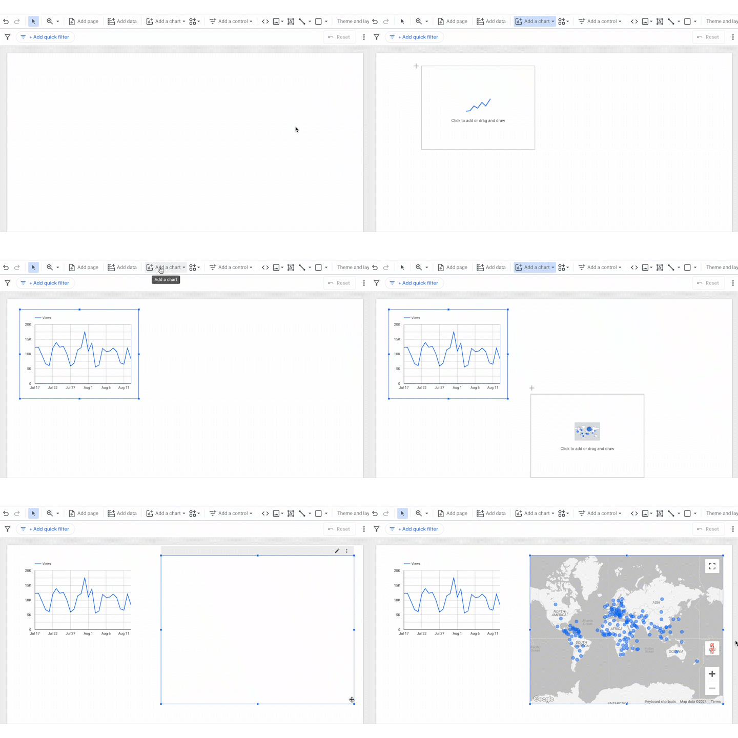
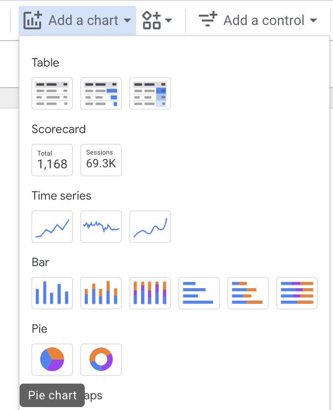
To create a completely new visualization, click the “Add a chart” menu to reveal the full list of visualizations. Note that more visualizations can be accessed by scrolling down within this menu.

Once you’ve found a visualization that looks useful, click on it. A new chart window will now follow your mouse, allowing you to specify where on the report slide you would like to place the chart. You can either click to place the chart down exactly where your mouse is, or hold and drag to draw the chart at a certain size.
Visualizations and When to Use Them
We’ve outlined the visualizations we use the most in Looker; you will most likely want to use them, too. While every chart is configurable, some do a better job at visualizing certain data than others.
Table
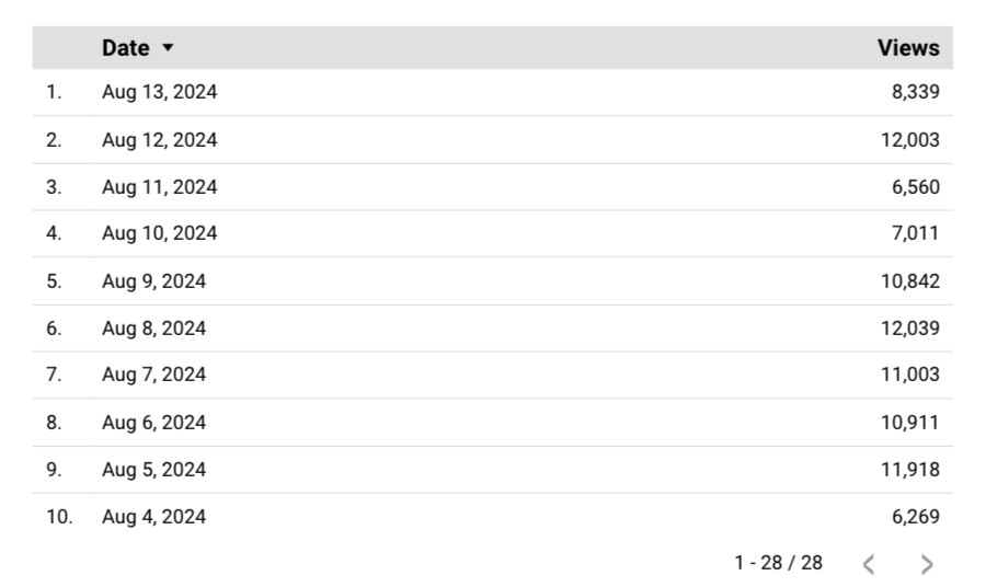
- Summary: A list of configurable rows and columns, similar to a spreadsheet.
- What it does well: Simple and straightforward. Versatile configuration if needed.
- What it doesn’t do well: Not the most engaging visually. Doesn’t convey data over time well.
There’s a reason the Table is the default visualization within Looker Studio. If you’re looking to generate a quick report, a table is the simplest way to pull data. It's also fairly straightforward to comprehend if you’re sharing this data within your organization. We walked through basic setup in Part 1 for a Table chart, but there are some additional bells and whistles you may find useful.
Drill Down Dimensions
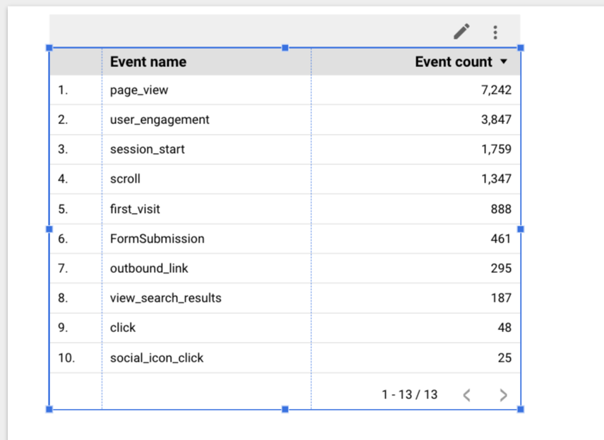
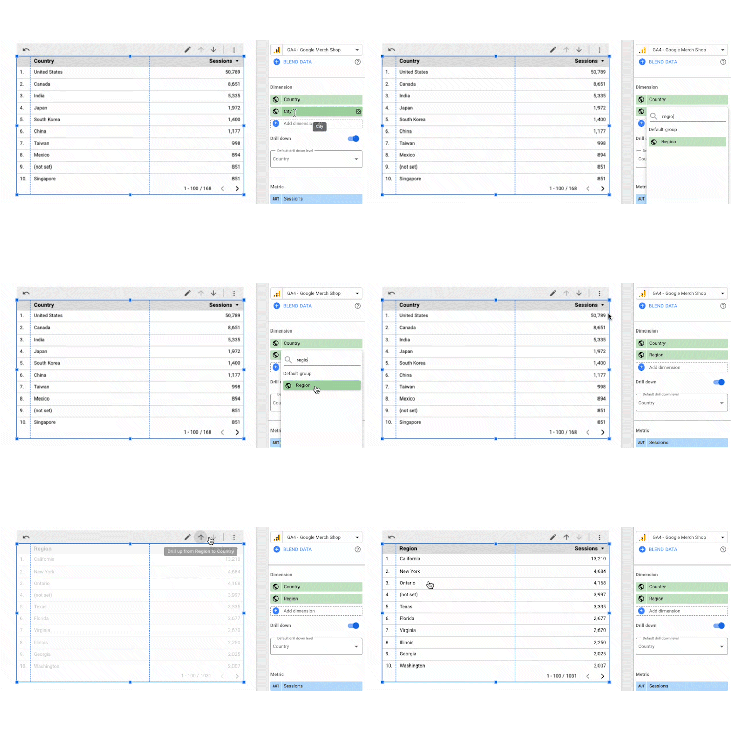
These allow you to provide more granular data with different dimensions all within one table. For example, the chart below shows the top session-generating countries for the default date range.
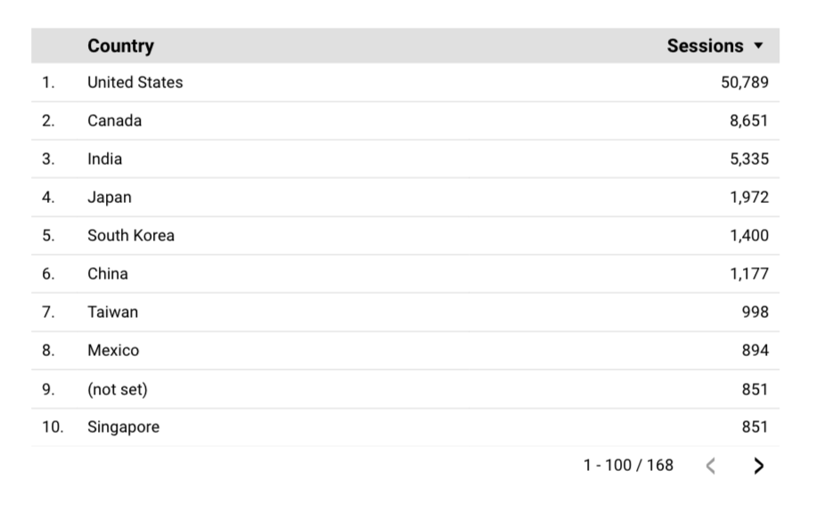
This information is useful at a macro scale, but what if I wanted to get more granular and see what states and cities were generating traffic in the United States? I could simply copy and paste the chart and swap out the Country dimension, but that would make for a messy report.
Within the Chart Setup menu, underneath Dimensions, check the “Drill down” option:
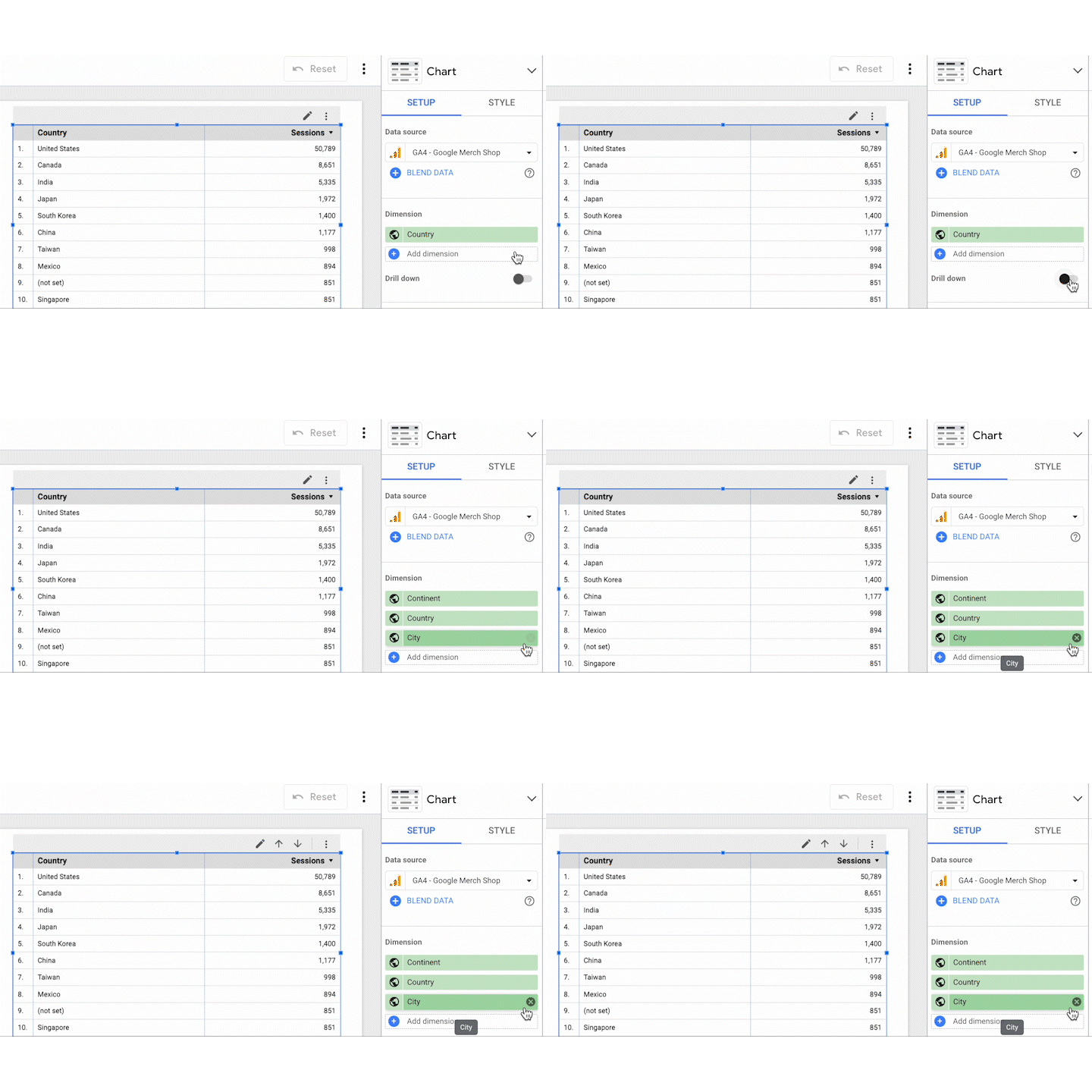
You’ll notice a few things happened when we turned on Drill Down. First, Looker Studio automatically added some new dimensions similar to the ones we already selected (Continent and City). You’ll also notice that an “up” and “down” arrow appeared in our chart header. These arrows allow us to “navigate” the dimensions we’ve selected for the report, in the order they appear in Chart Setup.
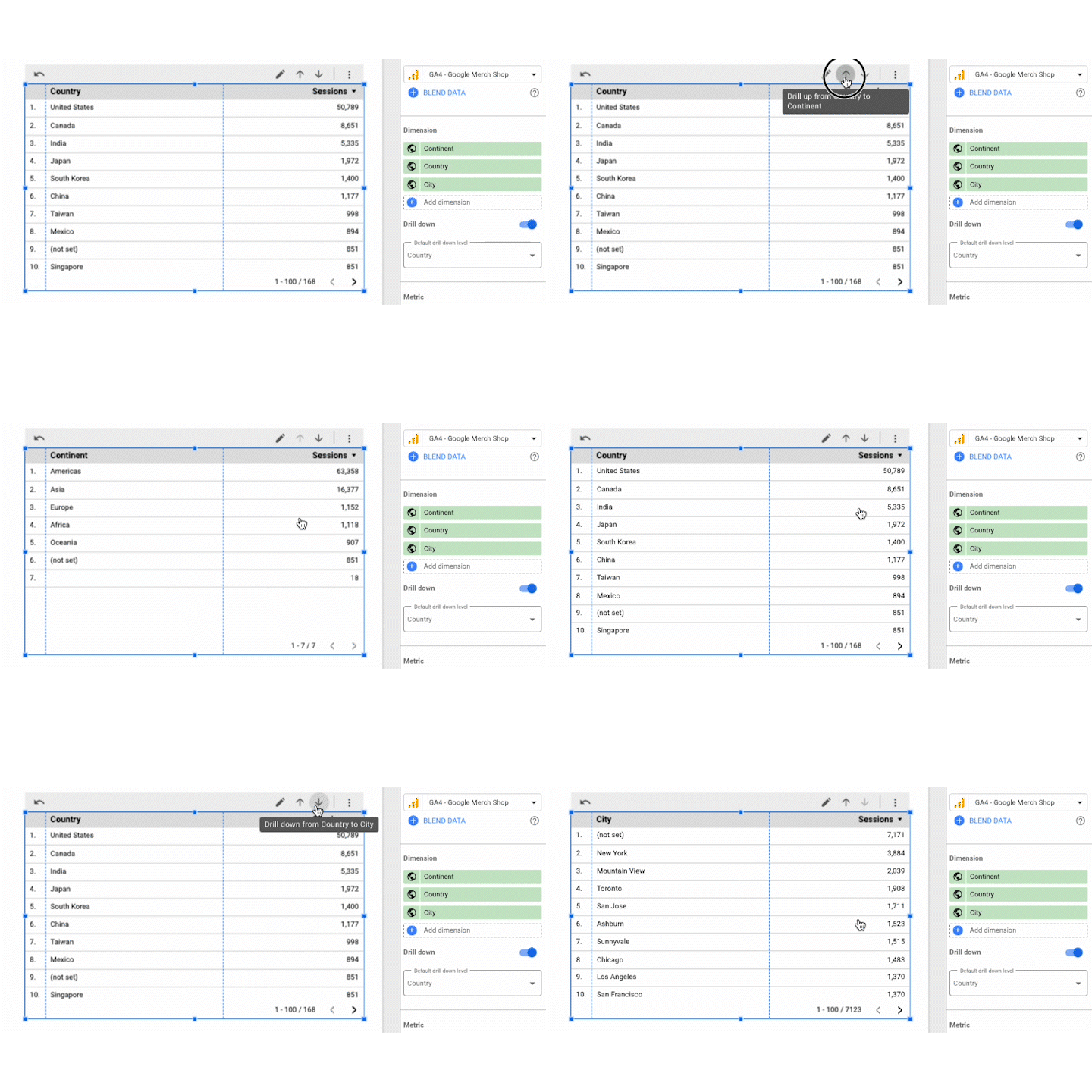
We can choose what dimension appears when the report is loaded using the “Default drill down level” dropdown below our dimensions.
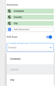
We’re not stuck with the dimensions Looker Studio selected, either. For example, perhaps “Continent” is too broad, and “City” is too granular. We can remove Continent from the Chart Setup by clicking the “X” icon that appears to the right of the label when we hover over it.

We can then swap City for Region by clicking into the City dimension in Chart Setup and searching for Region.
Optional Metrics
When looking at how to create custom reports in GA4, you likely want to showcase a robust set of metrics beyond the defaults. Similar to what drill down allows for dimensions, Optional Metrics allows the inclusion of additional metrics in our report and the control to choose when they should appear.
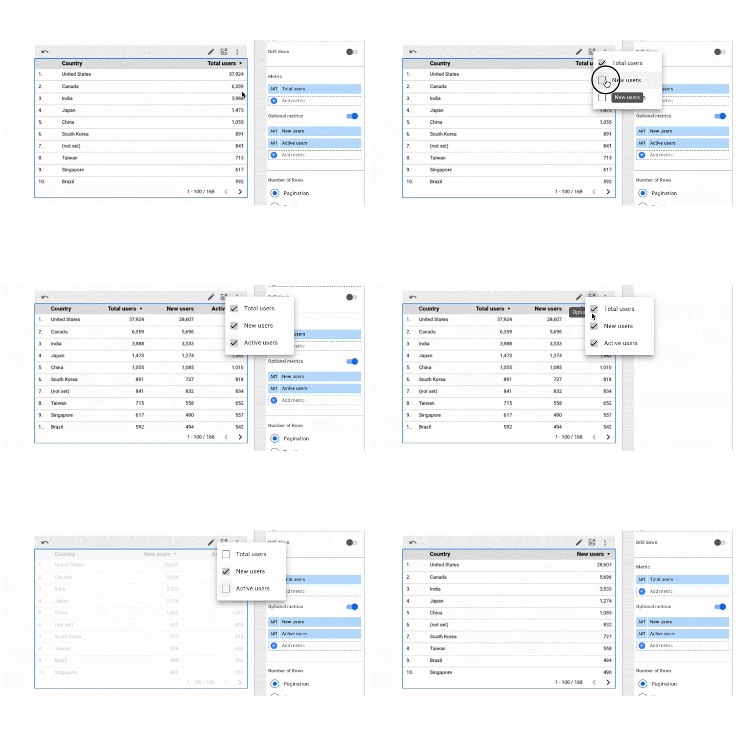
In the Chart Setup menu, turn on Optional Metrics. This will expose a new field with several new metrics to select. Note that these metrics do not initially appear in the report.
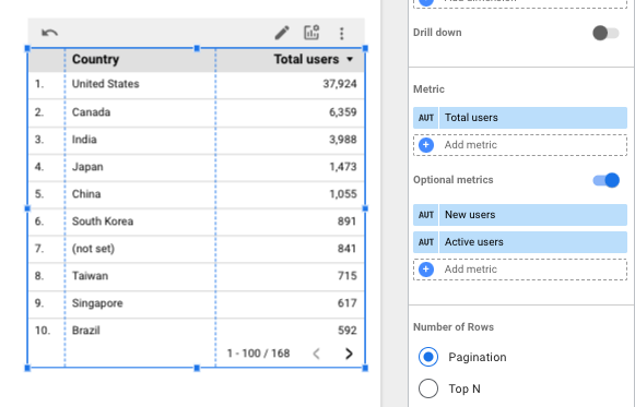
However, you may notice a new icon in the chart header. It looks like a bar graph with a small gear in the top right corner. Clicking this icon reveals all the metrics we’ve selected, and we can determine whether or not we want them to display.
Metric Sliders
This tool allows us to control how metrics display within a certain configurable range. For example, let's say I am trying to figure out how to create a report containing our site’s bounce rate by page and use a Table to generate the report below:
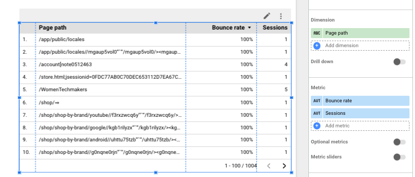
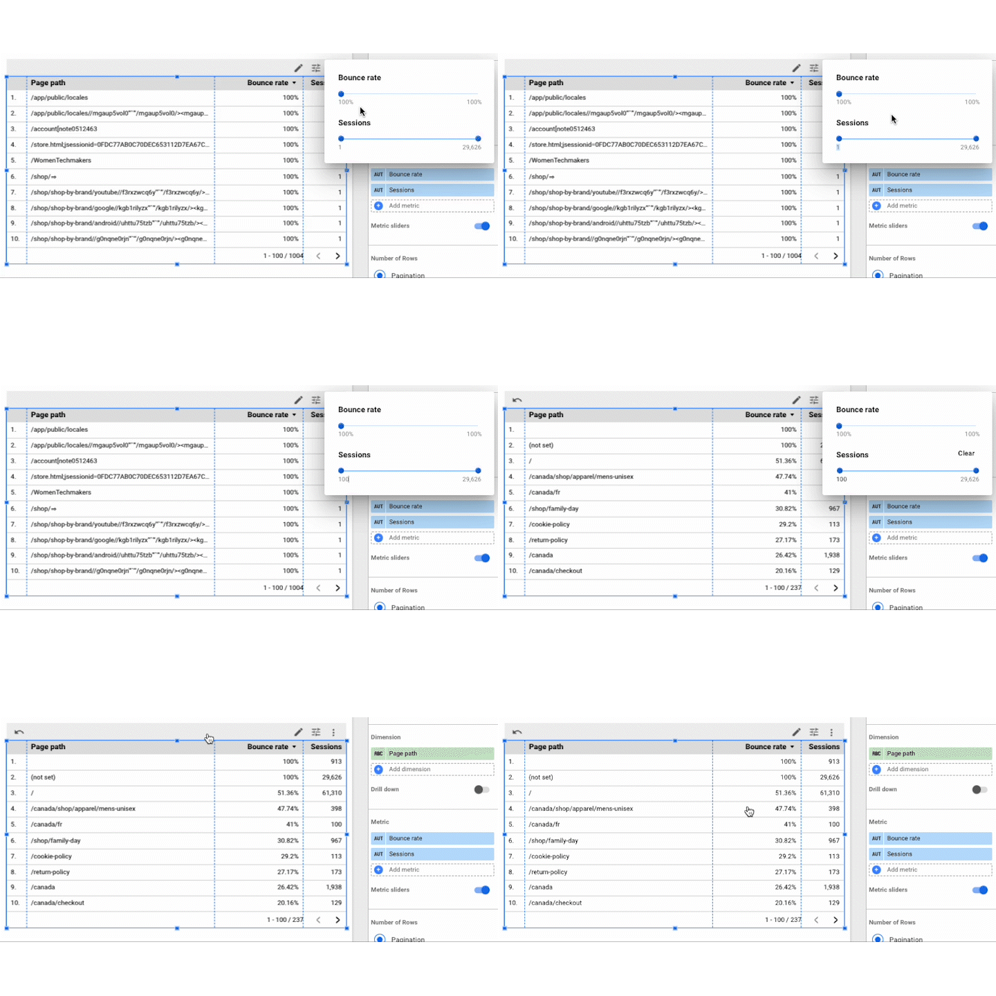
I’m not particularly interested in these pages that have only generated five sessions or less. We can remove these from the report by turning on Metric sliders underneath the Metrics header in the Chart Setup. This will expose a new icon in our chart header, which looks like a series of sliders.
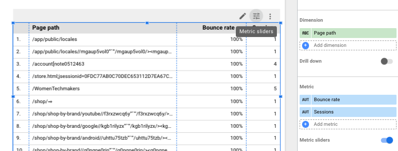
Clicking on this icon opens a menu that allows us to select a range for all metrics available in the report. For our example, let's narrow down the traffic we’re reviewing and set the lower bound to at least 100 sessions for the given timeframe.
Scorecard
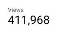
- Summary: Displays a single metric
- What it does well: KPIs and focus metrics
- What it doesn’t do well: Conveying context
When creating custom reports in GA4, use scorecards to focus on metrics that align closely with your overall business goals. This way, stakeholders can immediately assess performance without diving deeper into the data.
Click on the "Add a chart" button in the top menu. From the dropdown menu, select "Scorecard" under the "Chart" section. A box will appear on your report canvas.
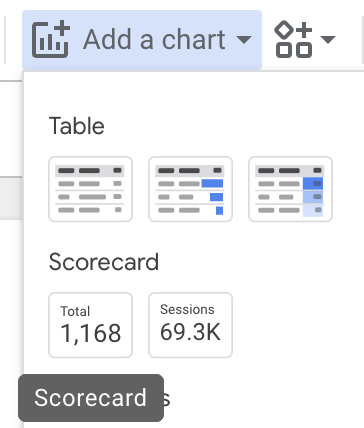
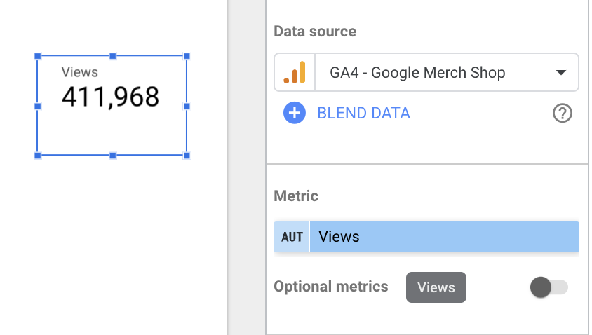
Once the scorecard is placed, the "Chart Setup" panel on the right will allow you to choose a metric. In the "Metric" section, click the current metric to open a dropdown, and search for the one you want to display (e.g. Sessions, Key events, Revenue).
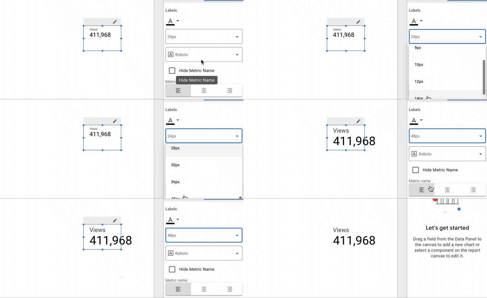
You can customize the display by adjusting the font, color, and background under the "Style" tab. This allows you to make the scorecard visually stand out when creating custom reports in Looker Studio.
Use scorecards for KPIs that need to be quickly monitored. For example, highlight the most crucial metrics that matter to your organization, like monthly revenue or session totals.
Time Series Chart
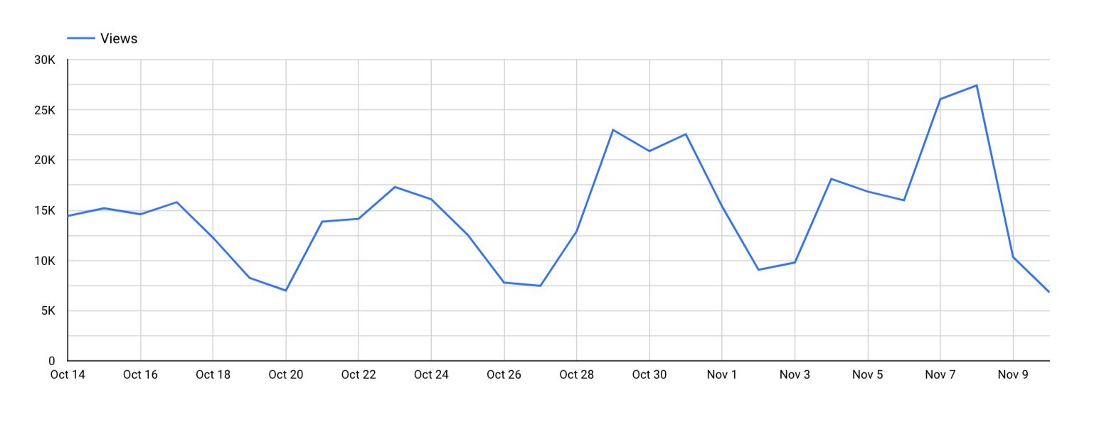
- Summary: Charts a metric over a time period
- What it does well: Highlight wins, losses, and discrepancies in data
- What it doesn’t do well: Multiple dimensions
The time series chart is particularly useful when visualizing metrics like traffic growth, conversion rates over time, or seasonal trends. This allows you to see how performance evolves, providing insight into periods of success or areas that need attention.
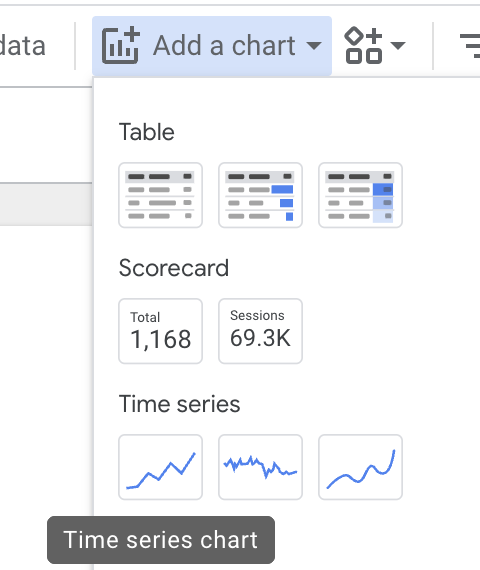
Go to "Add a chart" in the menu and select "Time series" under the "Chart" section. Once selected, draw the time series box where you want it to appear on your report.
Under "Chart Setup" on the right, select the metric you'd like to display over time (e.g. Sessions, Bounce Rate, Conversion Rate).
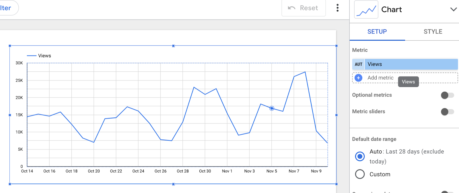
Looker Studio automatically assigns "Date" as the dimension for time series charts. If you need a specific date range, set it in the "Date Range" control.
You can compare multiple periods by selecting "Date Range Comparison" under "Chart Setup," which lets you see metrics for different time ranges side-by-side (e.g. month-over-month comparison).
You can add filters like specific traffic sources or countries to narrow down the data shown in the time series chart.
When learning how to create custom reports in Looker Studio, limit the number of metrics displayed at once to maintain clarity. Use the time series chart to track performance over specific periods, like monthly traffic or seasonal trends.
Pie Chart
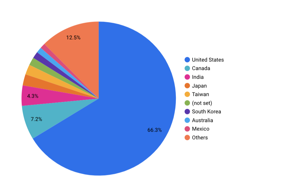
- Summary: Displays top earners for a given metric
- What it does well: Demographics
- What it doesn’t do well: Granular analysis
Pie charts excel at showing proportions within a dataset, such as the top traffic sources, top-performing pages, or user demographics. They provide a quick, visual way to see the distribution of a metric, making them ideal for comparison between categories or groups. Use pie charts sparingly and only when you want to highlight a clear winner or top segment, such as the top three traffic sources or leading device categories.
Click "Add a chart" and choose "Pie chart" from the list of options. Draw the chart on the report where you want it placed.
In the "Chart Setup" panel, pick a metric like "Sessions" or "Conversions" and then choose a dimension that you want to break it down by, such as "Source/Medium," "Device Category," or "Country."
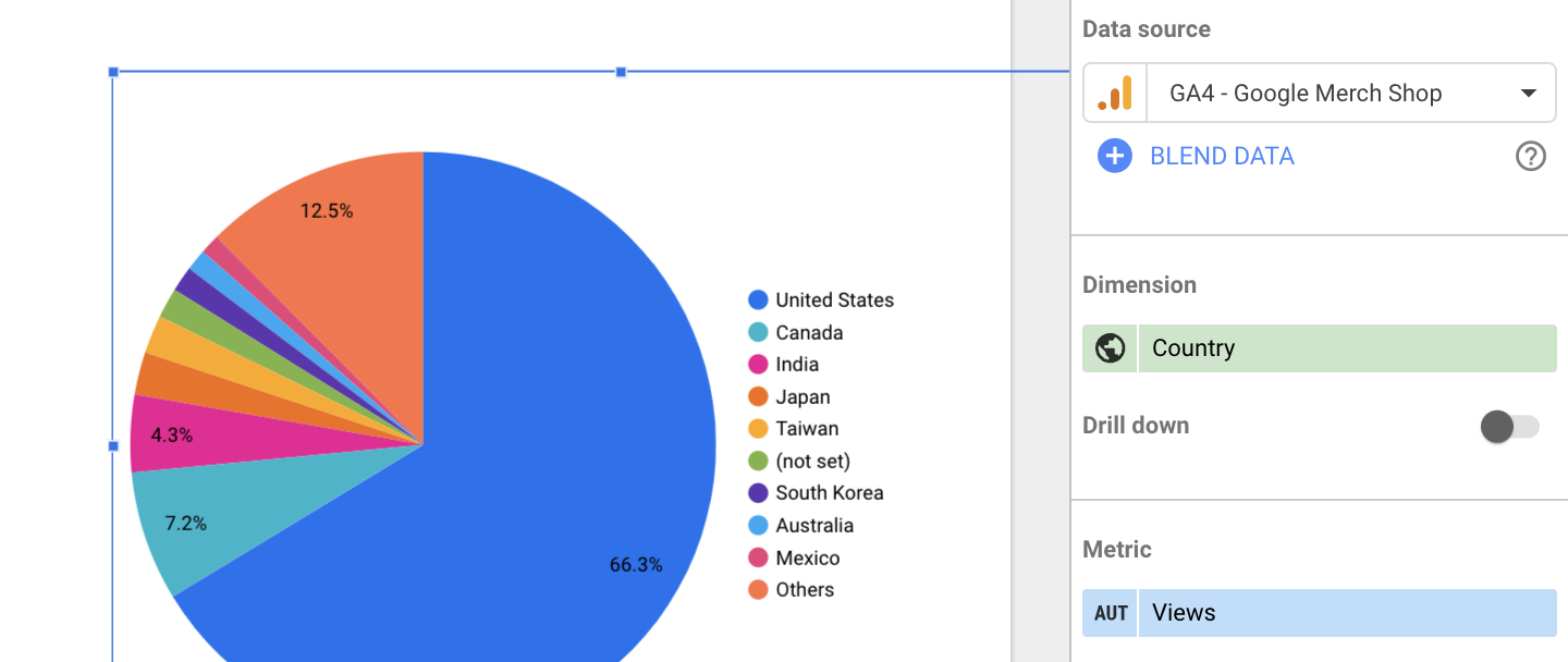
Under the "Style" tab, you can limit the number of slices to the top performers. For example, you might only want to display the top 5 traffic sources to avoid a cluttered pie chart.
You can adjust the labeling, font sizes, and color schemes in the "Style" tab to enhance readability.
Use pie charts for categorical breakdowns like top traffic sources, most popular products, or leading device types. Avoid using them when there are too many categories as it can make the chart unreadable.
Gauge With Ranges
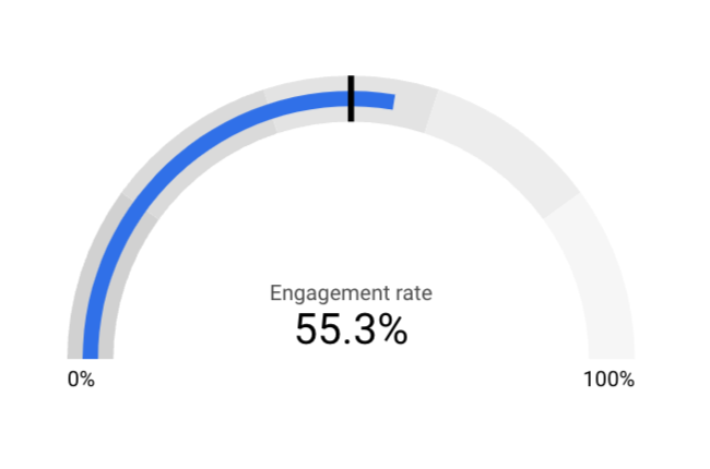
- Summary: Plots metric totals on a user-determined scale
- What it does well: Clearly indicate how your site is performing to your metrics
- What it doesn’t do well: Requires custom configuration for each use for best results
Gauges are great for quickly indicating how your site is performing against specific goals or benchmarks. For example, you can set a gauge to show how close you are to hitting a revenue target or whether your bounce rate is within an acceptable range. The color-coded ranges provide an easy-to-read visual cue on whether you are performing well or falling behind.
To set up a gauge chart, choose your metric and configure the scale to reflect your performance targets. This chart is particularly effective for tracking goals, such as hitting a certain number of sessions or staying within a target bounce rate.
Go to "Add a chart" and select "Gauge with ranges" from the menu. Place the chart onto your canvas.
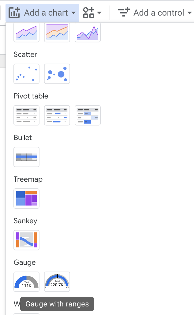
In the "Chart Setup" panel, choose the metric you want to track (e.g., Bounce Rate, Revenue, or Page Load Time).
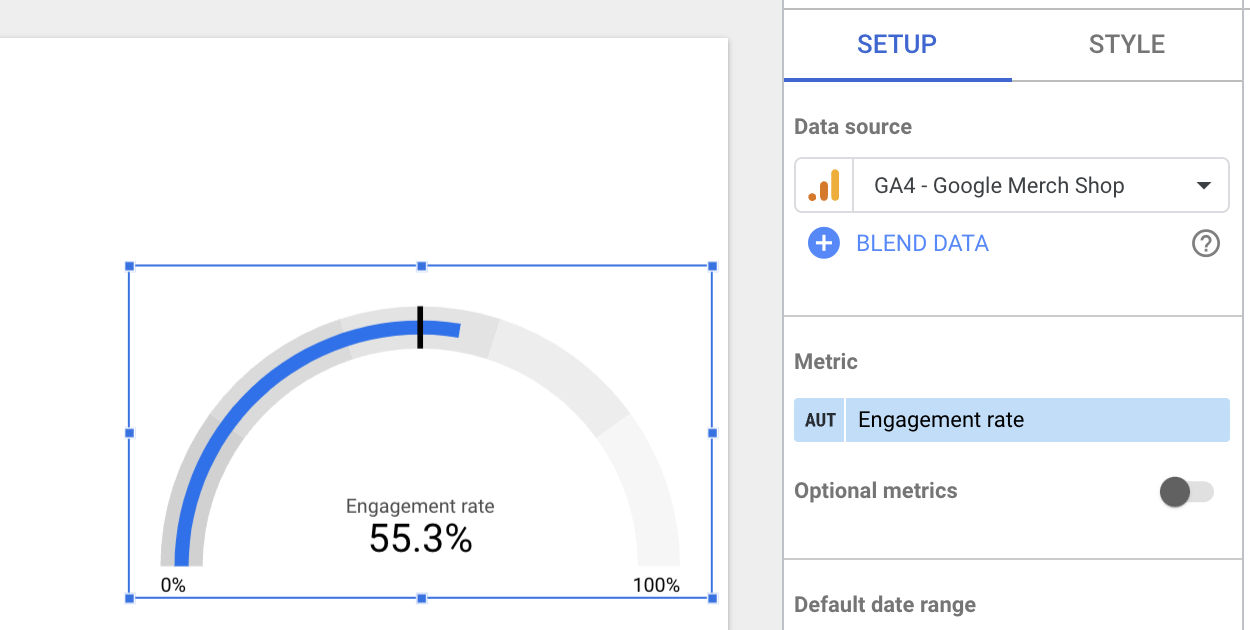
To configure ranges, switch to the "Style" tab. Here you can define the minimum and maximum values for the gauge. Set the “Min” and “Max” values to match the scale of your chosen metric. For example, if you're tracking conversion rate, you might set the gauge from 0 to 1.
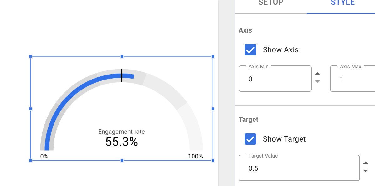
Use gauges for goal-based metrics that have a clear target. For instance, you could track whether your site’s average load time falls within acceptable limits or how close you are to achieving a specific revenue target.
Wrap-up
The bottom line is, there is no “one size fits all” report when learning how to create custom reports in Looker Studio. The tool has so much flexibility that it’s up to you to decide what data and KPIs are most important to you and your organization, and which visualization style makes most sense for your needs.
We’d love to connect if you need help figuring out what style of reporting is best for you, or if you want to get more in-depth training for your team. Get in touch!
And if you prefer to learn live and in person, sign up for our upcoming webinar all around data visualization in Looker Studio.


